

#39. When a story fails to hit home: Narrative and brand identity lessons from Wuthering Heights
I joined my mum and her friend to watch the latest adaptation of Wuthering Heights, directed by Emerald Fennell. I thought I’d enjoy this film, but I left feeling betrayed and puzzled. For me, it didn’t hit home at all.
Not only did I feel completely out of place among the young audience, but I also cringed at the shallow dialogue and hyper-sexualised scenes. This surprised me, because I read Emily Brontë’s novel when I was thirteen, and it didn’t make me feel like that.
One good thing happened, though. During the break, I took out my notebook and started writing out designer lessons and essential qualities for good storytelling! (This also happened when I went to see F1, the film about Formula One, as you may remember).
When these lessons and qualities are missing, you don’t just disappoint your audience, you risk diluting your brand’s entire identity. To further unpack this idea, I will borrow three elements from Jean-Noël Kapferer’s Brand Identity Prism (1996).

Jean-Noël Kapferer’s Brand Identity Prism (1996). The prism identifies six points of brand identity, divided over two dimensions of expression and construction source.
Lesson 1: Relationship

Relationship. The type of connection the brand builds with its audience.
Emerald Fennell is not an inexperienced director, and her take on Wuthering Heights proves how well she knows her target audience.
After a few scenes, it became clear: this film isn’t for a 35–50-year-old audience who read (and loved) the book as teenagers. Instead, the cinema was filled with people aged 18–25. I can’t comment on whether they read the book, but many critics describe the film as being aesthetically aligned with the TikTok generation; built for virality and shareability.
Margot Robbie (Cathy in the movie, and co-producer) put it plainly: “You should make movies for the people who are going to buy tickets.” Strategically, this makes sense. However, by using a legacy title like Wuthering Heights, the film triggered expectations from a much broader, intergenerational audience – and that’s where the tension lies.
It wasn’t that the film didn’t know its audience; it just inherited a new one. In doing so, it neglected a loyal audience that already exists.
There is a lesson for designers here. Stories evolve, but relationships must remain coherent.
If you reposition your brand entirely for Gen Z, thus discarding the emotional capital built over decades, you risk breaking the relationship with your existing audience. Repositioning requires courage and risk. But brands that last evolve their expression, not their compass.
A strong example is Nintendo.

Nintendo. From the NES to the Switch, the media changed dramatically. The technology evolved. The audiences expanded.
From the NES to the Switch, the media changed dramatically. The technology evolved. The audiences expanded. But the core promise – playful innovation and shared gaming experiences – remained constant.
Now, older generations pass their cherished nostalgia to the younger ones. That’s intergenerational elasticity and relationship management at play!
Lesson 2: Physique
Physique. The tangible, visible expression of the brand.
There’s no doubt that Wuthering Heights is visually impressive. A great deal of money was spent on opulent costumes. Showy, dramatic landscapes tried to evoke the novel’s gothic atmosphere, using the same polished cinematography we saw in Fennell’s other film, Saltburn.
Yet I wasn't sold. For me, everything about Wuthering Heights was surface-level. It didn’t come close to portraying the novel’s emotional depth.
Instead, the psychological manipulation becomes a sensational subplot. The class difference is flattened into a costume drama. The generational trauma disappears entirely (the story ends where the novel truly begins).
Everything is visually memorable, but emotions are what truly resonate. It is the emotions that will follow you home from the cinema.
The second lesson for designers?
Without substance, aesthetics get lost.
I’ve worked with startups that have invested heavily in polished UI, refined micro-interactions, motion design, and AI features… while completely missing why the product exists.
Here, I return to Bauhaus's manifesto “Form follows function”. This doesn’t mean “make it ugly”.
It means “add nothing without intention”.
In the era of AI, the confusion feels stronger. Features are added because they are trending, not because they strengthen the narrative of the product.
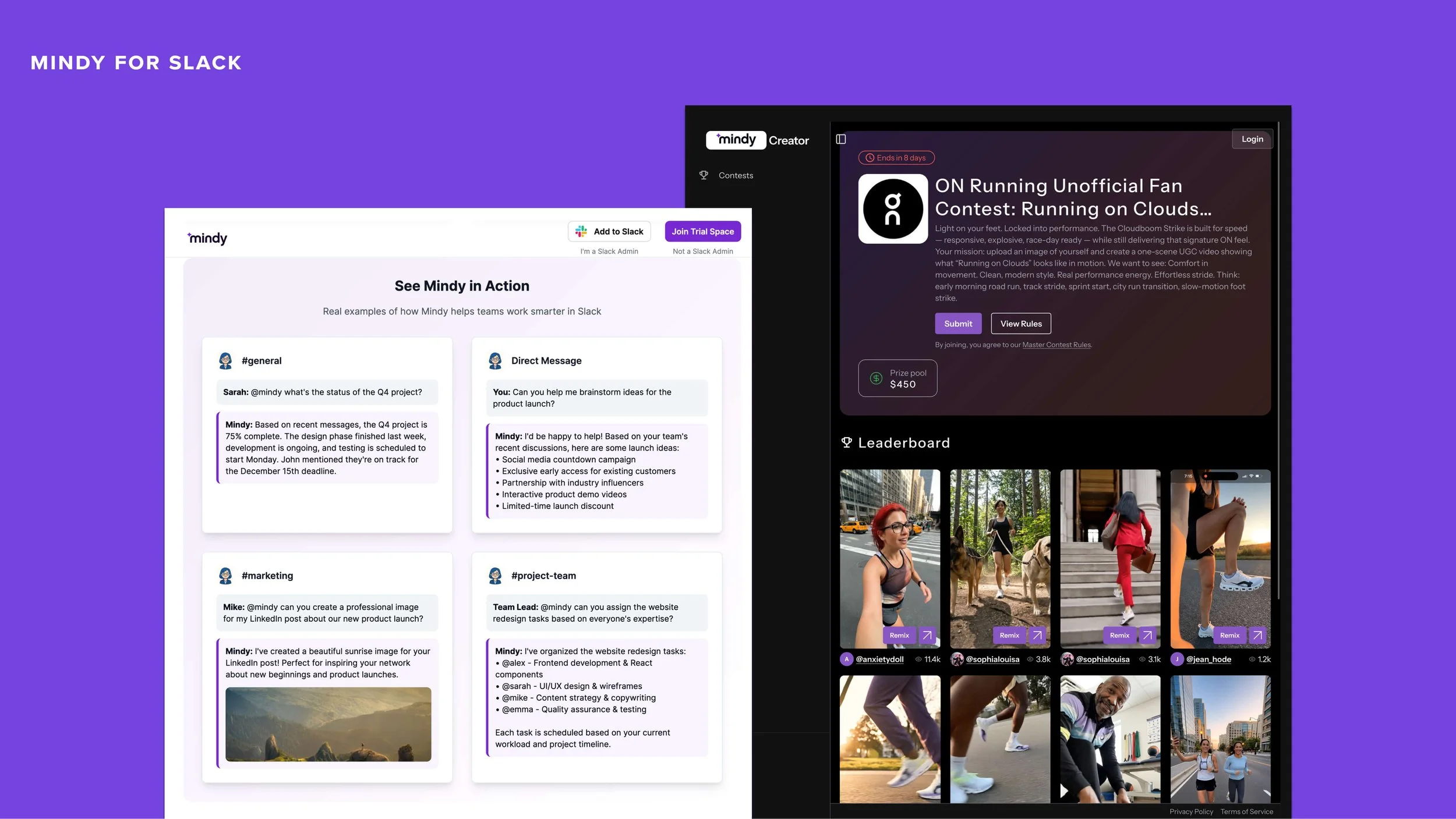
Mindy for Slack. From productivity assistant to AI image generator: Mindy reflects the industry’s rush towards creative AI features (not necessarily Slack’s original collaboration narrative).
Take the messaging platform, Slack. Originally positioned around simplifying team communication and collaboration, its AI addition, Mindy, feels more like the result of industry pressure than narrative continuity. Some features are useful (summarising messages, assigning tasks). But does the genAI feature (and context around it) honestly reinforce Slack’s core promise?

Dyson Hairdryer. Dyson’s aesthetic is both bold and recognisable; deeply connected to its engineering principles.
Let’s compare this example with Dyson, a premium electronics brand that came to mind because of a recent discussion with my hairdresser.
Dyson’s aesthetic is both bold and recognisable; deeply connected to its engineering principles. When I asked my hairdresser why he prefers Dyson products, he explained that he has always dreamed of owning them, due to their impressive power and lightweight design. He also shared how the heavy, traditional salon hairdryers often leave his hands fatigued, especially after drying long hair.
Dyson managed to address my hairdresser’s issue while also ensuring its products look stylish. This is important in a French hair salon, where aesthetic counts (almost) as much as the quality of the haircut. Dyson also teaches us that effective performance and technical precision in design is an intoxicating blend: one that both justifies higher prices and builds customer trust.
Lesson 3: Self-Image
Self-image. How customers see themselves when they use the brand.
When I can predict every line of dialogue in a film, I lose interest.
As a 19th century novel, Wuthering Heights was genuinely disruptive. It explored class disparity, social alienation, generational damage, and the fear of the “other”. But the film adaptation softens this complexity into digestible drama.
Yes, the movie reflected its intended audience (see lesson 1), but it also failed to respect the self-image of readers who loved the book. Leaving the cinema, I felt diminished (and if I’m honest, ashamed to have been sitting there at all). I came yearning for the book’s sophistication, but I got a fancy blockbuster instead.
As a lesson for designers, this one is simple. Your audience must recognise themselves in your story.
When you use a product, you’re not just completing a task. You are reinforcing a perception of yourself.
Most of the time, users want to feel:
competent
intelligent
ahead
culturally aligned
When storytelling reduces complexity too much to fit a medium or an audience, it also risks diminishing the user’s aspirations. In this, cinema is not entirely to blame.
Pixar films are technically made for children, yet adults leave feeling seen rather than patronised. That is an example of masterful self-image control across generations.
For example, if you’ve ever tried learning a language, you may have noticed the quiet fight between Duolingo and Preply.

Preply ads (2025). Preply positions itself as the place where language learning becomes real.
Duolingo built its brand on gamification. Learning becomes playful, almost frictionless. Long streaks and cheerful reminders make you feel consistent and productive, brilliantly lowering the barrier to entry.
In reality, learning a language is a complex cognitive process. As such, some users will notice a gap between completing the exercises and actually being able to speak. The experience is entertaining, but competence doesn’t always follow at the same pace, and self-image begins to fracture.
Preply steps into this space with a very clear message and narrative: “You are not bad at languages. You simply need real tutors and real conversation."
In this scenario, the problem is not your intelligence, it’s the method. This is powerful positioning, because it restores the learner’s dignity.
When the promise of empowerment melts into a feeling of inadequacy, even subtly, the brand relationship weakens. Remember that competitors are always waiting in the wings, and they will build their narratives exactly where your audience’s confidence is shaken.
Last thoughts
Stories are powerful because they build relationships, embody values, and reinforce identity. When those three pillars are misaligned, even the most beautiful production can’t save the narrative.
Repositioning is not betrayal, but abandoning your narrative core is. Just like classic novels, brands can cross generations. On this journey, their values must remain coherent even as their expression evolves.
If you’re curious about using Kapferer’s Brand Identity Prism to design brands that last — and evolve without losing themselves — my workshop subscriptions are open. As a newsletter subscriber, you still have access to a special discounted price.