

#19. What Studio Ghibli Taught Me About Visual Storytelling in UX
From the section "The Story That Saved the Day Japan Edition” of The Sunday Tales.
The Story that Saved the Day is a section of The Sunday Tales that will inspire you through recounting fantastic brand stories. What makes them fantastic? Each of the featured brands were "saved" by implementing storytelling elements and methodologies in their business. Taken from a variety of industries and standpoints, these stories will show you how storytelling is a flexible and adaptable tool that, if used correctly, can produce exciting concepts and incredible achievements.
Along with some storytelling methodologies, I will also list some takeaways and lessons we can learn from each brand story. So get ready to take notes!
Before leaving for Japan, I decided to re-watch some movies from Studio Ghibli. Among my favourites are Spirited Away and the recent release, The Boy and the Heron.
I’ve been studying Japanese in my spare time, so I used these beloved films to help me remember Japanese expressions and words that would be useful during my trip. I also wanted to train my ears to understand spoken Japanese.
As I watched these two masterpieces, I admired the quality of the drawings and the stories, as I always do. But feeling inspired, I also scribbled down some ideas about visual storytelling that I’m going to share with you now, to help boost your next project.
Visual storytelling is an underrated superpower in UX
We tend to think of illustrations, videos and images in simple and restrained terms: as ways to condense ‘boring’ concepts or show how a product works (to replace a demo or tutorial) when designing apps and website pages.
However, visual storytelling is an extremely versatile superpower, whose limits are almost boundless!
For example, it can:
Simplify concepts, making them easier to understand and become more actionable.
Engage and persuade at emotional and cognitive levels.
Imbue real human experience into information, making it highly relatable.
Adding the “human factor" – elements that shape and direct thought, reflection, and action – is something Studio Ghibli does so well.
I will present this factor in three simple, timeless lessons, also comparing them with some of my own recent designs, to highlight the real power of visualisation.
Simplify concepts: designing for clarity and impact
One of my favourite scenes from Spirited Away is when Chihiro travels quietly on the train, accompanied by No Face. There is hardly any dialogue. Instead, the relationship between the protagonist and No Face is shown through gestures, the gentle rhythm of the train, and the understated tension between them.
No Face doesn't speak, yet there's an undeniable presence; he watches over Chihiro, sometimes unsettling her. Studio Ghibli, as already seen in the famous Totoro, masterfully relies on expressions, posture, and environment – rather than words – to move the story forwards.
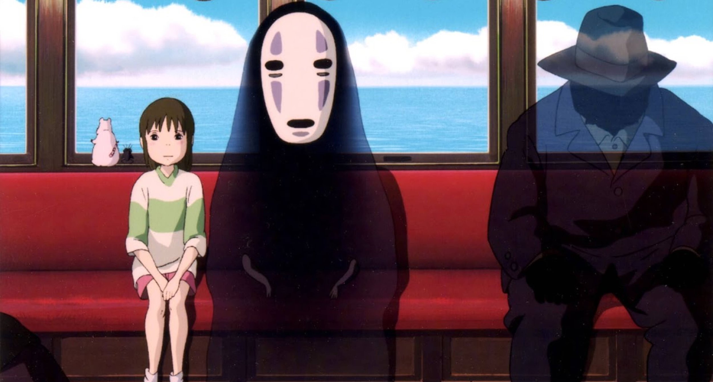
A scene from Spirited Away: the relationship between the protagonist and No Face is shown through gestures and the gentle rhythm of the train.
This very principle influenced how I approached the re-design of the website of Kialo Edu, an app created specifically for educators.
The website is designed to inform and gently persuade. It allows the value of the product to reveal itself through clear and intentional illustrations of simplified features, which have been designed to solve the real issues that educators face in classrooms.
Given that the platform is free and tailored for teachers, I didn't want to oversell or overwhelm the user with too much information, especially when the site also has a fully-functional demo of a sample discussion.

Kialo Edu Home Page: the illustrations intentionally represent a simplify UI of the specific feature so that could be recognised by the users in the real app.
On the homepage and throughout the features page, I intentionally kept the content focused and visually clear. Rather than explaining every feature in exhaustive detail, I designed some illustrations and UI snippets to give educators a strong sense of how the app feels and functions.

Kialo Edu Features: There are so many features and so little time. So synthesis and accuracy were the two principles that guided the design of these illustrations.
This quiet, confident approach respects the time and intelligence of the educators; in the same way that Ghibli's use of silence and subtle cues respects the viewer's ability to interpret.
Key takeaway:
In both storytelling and UX, there is immense power in restraint. You don't need to shout about every benefit or guide users painstakingly through each step. Sometimes, the most compelling designs are those that step back and allow users to join the dots for themselves.
Emotional connection: creating cohesive and immersive experiences
The worlds of Studio Ghibli are deeply inspired by the childhood and imagination of its creator, Hayao Miyazaki.
In The Boy and the Heron, for example, the protagonist's father works in an aeroplane factory. We witness a scene in which some of the aeroplane parts are brought to the grand villa, and where Miyazaki meticulously shows us their detail: the gears, the structure, the moving parts.
It’s not the first time Miyazaki has devoted such attention to the aviation world. His father, Katsuji Miyazaki, was the director of Miyazaki Airplane, a company that manufactured parts for fighter planes during the Second World War.
Miyazaki has often spoken about his conflicted feelings regarding the beauty of flying machines and their connection to war. This emotional complexity shows in his films, in that he presents aviation with awe and wonder, but always in tension with parallel worlds that offer relief, escape, or healing to the protagonist.

A scene from The Boy and the Heron: some of the aeroplane parts are brought to the grand villa of the protagonist, and Miyazaki takes the opportunity to meticulously shows us their details.
In design, we often assume that emotional connection comes from colours, fonts, tone of voice, or the quality of an image. But real emotional connection goes beyond pure aesthetics—it's about creating a cohesive, seamless experience that feels familiar, wherever the user encounters the brand.
This was exactly my approach when I was called upon to design the landing page for the second course of UX expert Vitaly Friedman, How to Measure UX and Design Impact. I was also asked to design Vitaly’s new website Web Adventures, which gathers together his many workshops, talks, and events around the globe.


The illustrations for Vitaly Friedman’s websites: I created a world that connects both visually and emotionally with the user—ensuring that every interaction is unique whilst also feeling reassuringly familiar.
When visiting these sites, the user is immediately drawn to the beauty of the illustrations, the elegant animations, and the bright colours.
However, each site is consistent in the way it interacts with the user. Every page, even if different in theme or content, feels like a natural continuation of the Vitaly-related experiences the user may have already explored.
Each landing page became part of a larger narrative, one that reflects Vitaly's expertise and passion without ever feeling fragmented or disconnected.
In this way, I created a world that connects both visually and emotionally with the user—ensuring that every interaction is unique whilst also feeling reassuringly familiar.
Key takeaway:
In both storytelling and UX, emotional connection is not just about repetition or aesthetics. It’s about crafting an experience in which every interaction feels like it belongs to the same narrative. This will foster a deeper relationship with the user; one that naturally builds trust and loyalty.
Connect information to human experience: creating visuals with purpose
What I’ve always loved about Spirited Away and The Boy and the Heron is how we experience – and learn from – life through the eyes of their young protagonists.
The children in Studio Ghibli’s films are often more mature and grounded than the adults around them. They are brave, curious, and determined in their choices, even when those choices are difficult.

Chihiro and Mahito: the children in Studio Ghibli’s films are often more mature and grounded than the adults around them.
In Spirited Away, Chihiro is visibly uncomfortable as her parents greedily sit and eat the food offered to them without hesitation. In The Boy and the Heron, the protagonist doesn’t simply move on from the trauma of his past. Instead, he steps into a mysterious, potentially dangerous tower knowing it may cost him his life, because for him the truth matters more than forgetting.
It’s through these young characters that the stories evolve. Yet while these are stories about children, they’re never childish.
The characters hold all the fears and uncertainties of their age, but they face them with the maturity of adults and the freedom of imagination that only children have. That’s a manifesto for life right there, and it’s a huge reason why Studio Ghibli’s narratives speak so deeply to adults.

A scene from Spirited Away: Chihiro is visibly uncomfortable as her parents greedily sit and eat the food offered to them without hesitation.
In the same way, whenever I create illustrations or visual systems, whether for web, books, or physical spaces, I always pause to ask:
What’s the purpose of this illustration? What do I want the user to feel or take with them after this experience?
No visual element of my work begins without these questions.
One example that has stayed with me is the NFT collection I created for AfterApp, a blockchain-based app designed to help people create immutable wills. Thinking about death is never pleasant, but during the height of the COVID-19 pandemic it was a thought that lingered constantly in the background of our lives.
NFTs are usually light-hearted collectables; sometimes playful or purely decorative. But how do you create something that people want to collect when the subject is their death?
This clearly required a different approach. So I imagined visuals that would evoke reassurance, going beyond religion or beliefs. Spacious architectural forms, open skies, quiet scenes— simple images that suggest solitude without sadness. Peace without silence. Spaces that feel calm, contemplative, and universal.

The NFT for After App: how do you create something that people want to collect when the subject is their death?
Even though the NFTs were merely created to be exchanged between After App’s users (or Afterists, as the community called them), I wanted each one to feel like a small, shared reflection on something deeply human: something personal, and perhaps even comforting.
Key takeaway:
In storytelling and UX, always design with purpose. When visuals are rooted in human experience, they are more than mere decoration. They become moments that resonate, invite reflection, and inspire action.
Final thoughts: design visual stories that stay with us
While whimsical, playful and optimistic, Studio Ghibli teaches us that visual storytelling is most powerful when it feels familiar, sincere, and purposeful.
As UX designers, we have the same opportunity. Every interface, every illustration, and every small detail is part of a larger narrative.
When we design with intention, empathy, and trust, we create visual experiences that not only bring smiles but resonate deeply, shaping how people feel, think, and engage in their daily lives.
Did you enjoy what you just read? Subscribe to my Sunday Tales Newsletter!
The Sunday Tales is an initiative that was requested by many of the 2000+ students from my Domestika course. They wanted to know more about storytelling, but didn't know where to find the right information.
At the same time, I realised that many storytelling-related elements need to unfold clearly in my mind. Writing about them seemed like the ideal solution. That’s why I would be extremely grateful if you subscribed to this newsletter!
Your support will help Sunday Tales grow, and I hope you will always come away feeling informed and inspired.