

After App
The global pandemic of 2020 brought a rise in amateur investors. This, combined with the rocket-fuelled return rates found in cryptocurrencies, created an entirely new class of wealthy individuals.
This is the thrilling new world in which After made its first appearance.
Competencies
Digital Branding
Art Direction
UI/UX Design
Design System
NFT Design


The Project. The Story.
The Protagonists
After is one of many projects set up by the Boston-based fintech company, Stockcroc. It is a service related to creating and executing codicil and real-estate documents in the blockchain.
After also takes care of the automated distribution of these assets (both crypto and traditional) posthumously.
The Plot
After’s method is to use the blockchain technology of smart contracts to create an automated, transparent, immutable, and private distribution of assets at an event-based trigger in the future (aka, the death of a person or a change in their Will).
In the mind of its founders, After helps people to realise the power of wealth. For this reason, the main inspiration for their logo came from the keys of Pluto.
According to the Orphic Hymn to Pluto, among many other attributes Pluto owns the keys.
Such keys are connected to the God's capacity for giving wealth to humanity. A golden key was laid on the tongue of initiates by priests at Eleusis, which was a symbol of the revelation they were obligated to keep secret.
Finally, a key was widely used in ancient Greek burial practices (and later by Christians), along with a coin placed in the mouth to ensure a safe passage into the next world.
With such rich references, the key was an essential visual element of After's signature.
The brandmark is a key, with a bespoke design of the capital letter A on the top. This brandmark is enclosed in a geometric hexagonal shape, representing the value of privacy and secrecy.
The design of the capital letter is also used to represent the utility token #OBOL.
The sophisticated and elegant brandmark is paired with a bespoke sans serif typeface that represents the bold encrypted structure behind creating a Will through After’s platform.
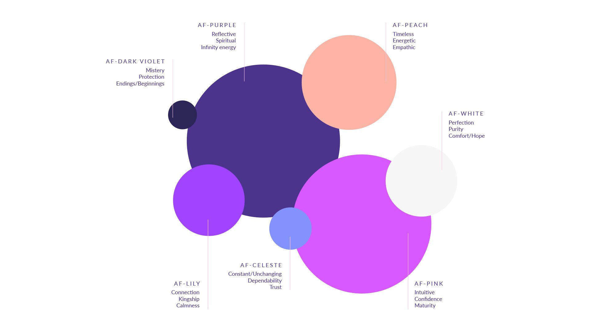
After's colour palette spans varied colours: from the very light, like white and pink, to darker, death-related shades like purple and black. Colours are always used with a gradient, to add depth to communication materials.
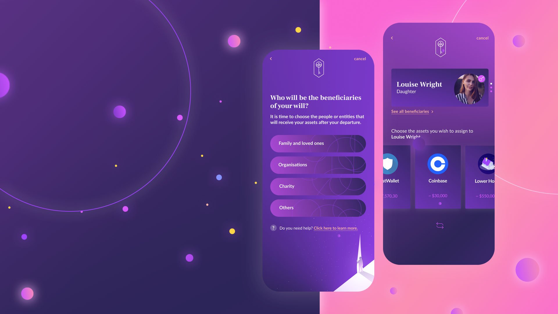
To engage with the first audience, we also launched a beta application of the After platform.
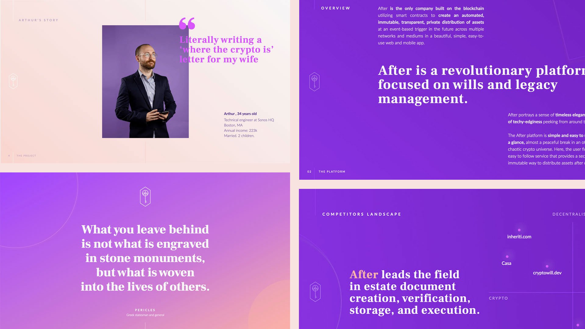
Rich in illustrations that talk about the metaphor of an afterlife (though without being strictly religious), the design of the application portrays a sense of timeless elegance with a hint of tech-edginess.
The illustrations are part of a non-fungible token (NFT) collection called Elysium (from the Greek, Ēlýsion pedion; a conception of the afterlife developed over time by some Greek religious and philosophical sects and cults).
Users find the app easy to understand at a glance, and thanks to a double encrypted vault that stores all sensitive information on the device, secure.
With the same feeling in mind, I also designed the landing page for the application, on which users are informed about After's services, and can subscribe to the waiting list for its release.
The Results
After is a platform designed with security and control in mind. After will soon lead the field in estate document creation, verification, storage, and execution.
At the moment of writing, the app beta version has been released to a secure group of investors.
