
#36. Does "Above the fold" work in the age of infinite scroll? Part 1: The Teaser Strategy
People scroll on the web… a lot!
As a concept, infinite scroll was invented in 2006 by Aza Raskin, as he worked on user interfaces. His intention was to reduce friction, but little did he know that one day his concept would be used to create and embed social media addiction.
Infinite scroll has endured because it taps into essential human mechanisms. Some studies in UX psychology prove this, with the following insights:
Removal of stopping cues: Pagination gives your brain a natural pause: page finished, decision time. Infinite scroll removes that pause, so your brain stays in “consumption mode”.
Variable reward loop: You don’t know what’s coming next! Sometimes it’s boring, but sometimes it’s gold. This unpredictability triggers the same dopamine loops used when we play slot machines: the idea of winning keeps us playing, even when we’ve lost.
Perceived effort reduction: Scrolling feels easier than clicking. Less effort = less conscious decision-making.
Since the vast majority of people are exposed to social media, the behaviour we display on web pages has adapted to how we view our social feeds. That’s why, as designers, our job goes much further than “above the fold”.

Infinity scroll culture. Infinite scroll has endured because it taps into essential human mechanisms.
Infinite scroll has changed the game for web designers
These days, people actively expect to scroll on the internet. If they disengage with a web page, it’s because the experience isn’t rewarding their continued attention, as social media reliably does.
Let’s take a closer look at scrolling culture:
Users don’t evaluate pages in one glance, but evaluate them moment-by-moment.
Meaning is built progressively, not instantly.
As a designer, you therefore need to treat a page less like a movie poster, and more like the film itself: a cohesive story told in sequences.
The ways to build lasting attention are numerous. However, I will highlight three specific strategies, derived from my personal analysis of the cinematic world. You can apply these to your next project, for special effects worthy of an Oscar!:
The Teaser Strategy
The Sequence Strategy
The Agatha Christie Strategy
In this issue, I will explore The Teaser Strategy. The Sequence Strategy and The Agatha Christie strategy will be explained in forthcoming newsletters, so stay tuned.
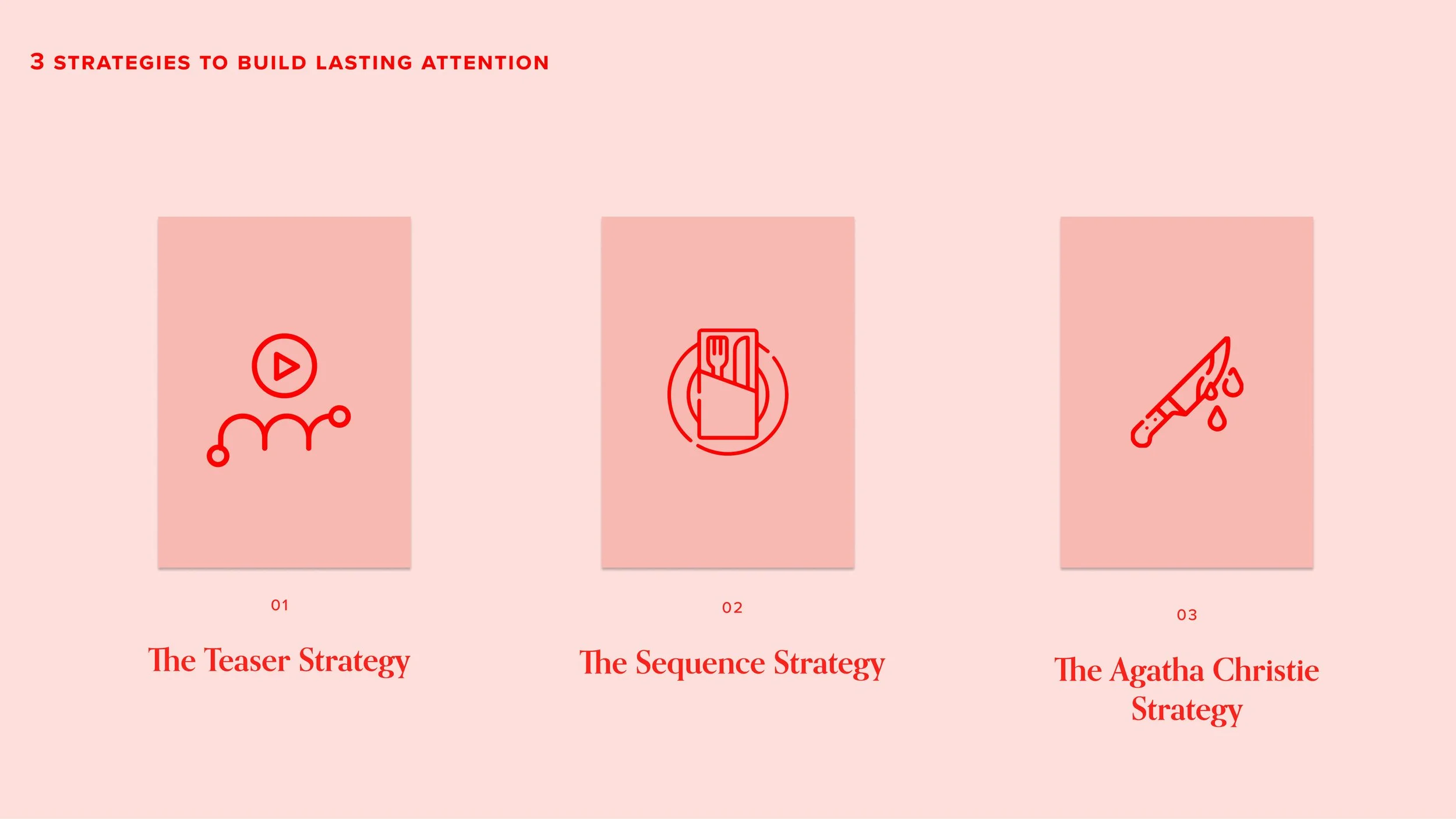
3 strategies to build lasting attention. They derive from my personal analysis of the cinematic world
The Teaser Strategy
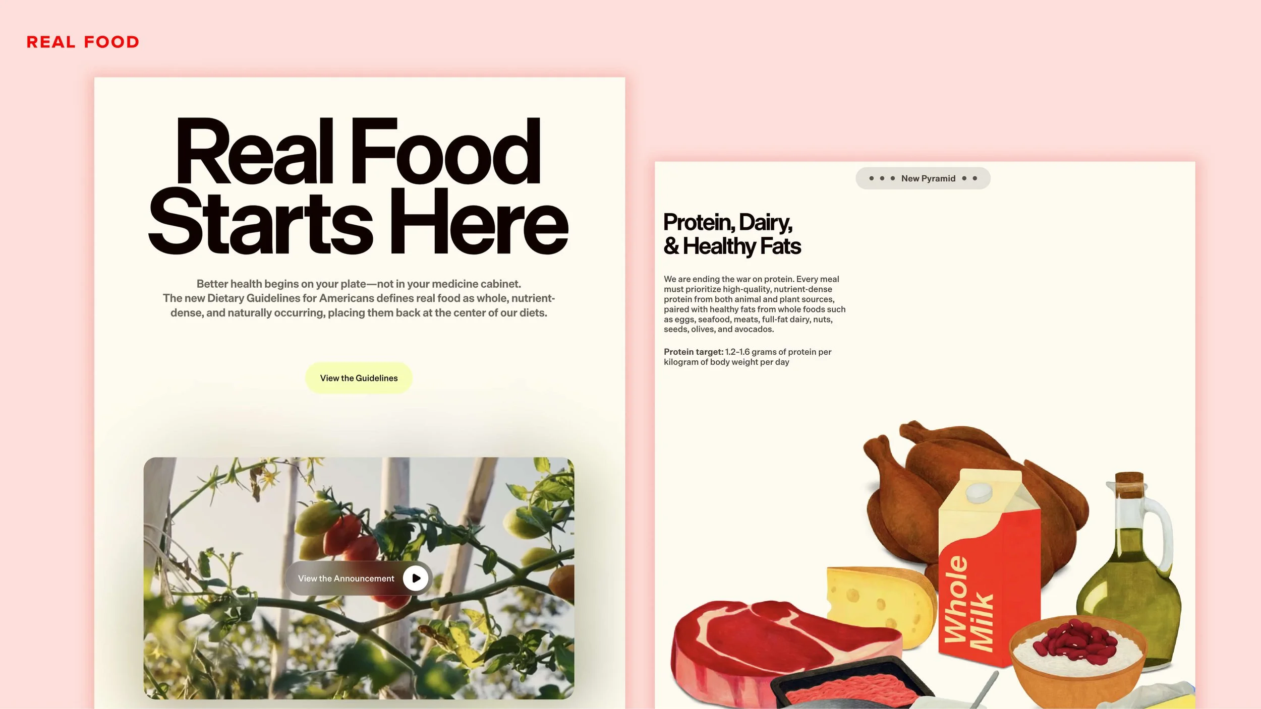
Screenshots from the website, Real Food.
Example: Read Food
The website outlines a new food framework (“The New Pyramid”) that guides healthier eating habits, places less emphasis on highly processed foods and added sugars, and aims to make nutrition advice more accessible and understandable to the public.
Purpose: Persuade (prioritise “real food” over highly processed products and reinforce nutrition’s role in preventing chronic disease).
Resolution: Ensure Completeness (support education for individuals, educators, healthcare providers, and federal nutrition programs (like school lunches, military meals, etc.) by offering resources, guidance, and visual tools like the New Pyramid).
Including a teaser could be the most common way to design a landing page, because it’s based on “Above the Fold”. However, in The Teaser Strategy the headline message merely anticipates the content of the page, rather than spoiling it.
As an example, I tend to cite The Virgin Suicides, a movie by Sofia Coppola. We know the end of the story right from the start. Five young sisters will die, but we don't know how.
Director Sofia Coppola builds an immersive story around this sad teaser, feeding the viewer intriguing background information about the lives of these girls and the circumstances that led to their inevitable endings.
The Virgin Suicides by Sofia Coppola. The Aristotle 3 -act structure shows how the movie evolves.
As designers, we can view our web pages just as Sofia Coppola saw The Virgin Suicides.
Act 1: The Setup / Teaser
The content is anticipated right at the beginning, giving the user a general idea of what the page is about. You can use videos, animations, beautiful imagery or illustrations to do this, with large typography depicting that vital “above the fold”-style opening sentence.
These are all common ways to anticipate without spoiling, inviting the user to scroll for more.
While the temptation may be strong to cram more and more information in, this is where the user will evaluate if the product or brand meets their needs. This why the first rule both in storytelling and UX design is important: know your audience!
So, in this specific area, there will ideally be space for just one or two actions or buttons: one primary, related to the purpose of the page, and one to explore more elements of the brand or product, which helps the user circle back to this very purpose. You are feeding information gradually, just as Sofia Coppola does in The Virgin Suicides.
The beginning. Real Food introduces the general concept with a catchy sentence and a video.
Act 2: The Confrontation / The Explanation
As such, the rest of the page needs to be a progressive explanation of the elements boldly introduced at the top (especially if you have used a video, since not everyone may play it).
Usually, there are no “escape”-driven actions (like read more/discover more), because we want the user to scroll, rather than leave this page. Any such actions must try to bring the user back to the exact point where they left the navigation.
As an example, think about sponsored posts on social media. These never open a new browser window, but a modal page that the user can easily close, unless and until they choose to engage with the sponsored product.
The content in this area must be presented in novel and intriguing ways: with schemes, illustrations or imagery that support the overriding purpose.
Use effects sparingly: too much stimulation (such as animation) can be detrimental, and if the page is too long users may end up feeling dizzy before they reach the end!
The confrontation. This section is a progressive explanation of the elements boldly introduced at the top.
Act 3: The Resolution / The Epilogue
The end section of the page is important: it is your story’s epilogue.
This where you clarify the resolutions of your page: for example, you may introduce a subscription plan, or a way to find further information. This helps the user move forward in their engagement with your brand.
In the case of the Real Food website, links to further resources have been introduced to ensure that the audience is better informed about the specific guidelines, thereby fulfilling the site’s intended resolution.
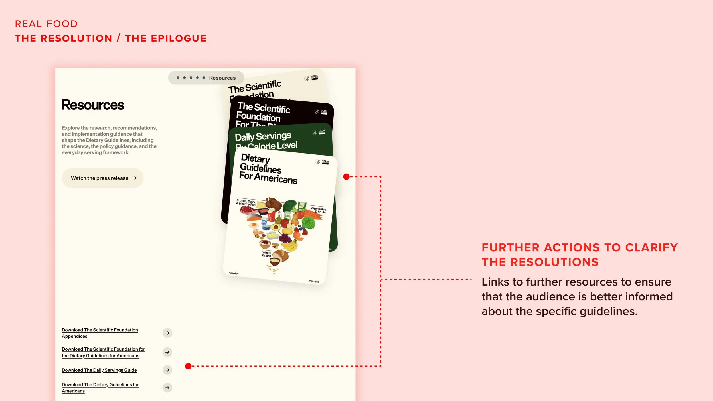
The Resolution. Use this section to help the user move forward in their engagement with your brand.
To clarify, and to stretch the movie analogy further, the end of the page is not the same as the end credits of a film! It should reward the user for their time and attention paid by scrolling there.
The Real Food website concludes with a playful carousel that presents a list of foods recommended by the New Pyramid.
It’s like the “It is real. A second season is coming soon!" on your favourite Netflix series.
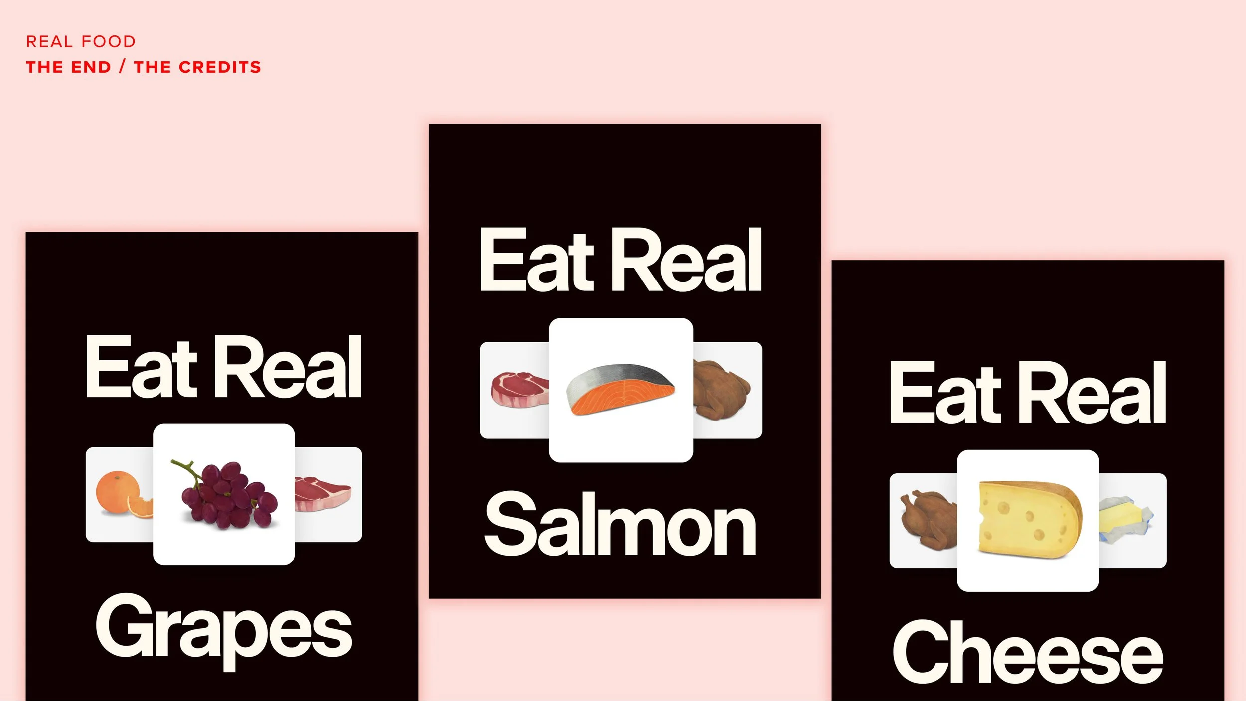
The End. This section should reward the user for their time and attention paid by scrolling there.
As a quick reminder, when using the Teaser Strategy:
Don’t do this:
Cram every feature in at the top
Treat the rest of the page as though it doesn’t count
Use the end of the page as “end credits”.
Overuse animations
Do this instead:
Use the top of the page to promise, not explain
Design the page as a flowing sequence
Reward scrolling with meaning
Let the page work as a whole, not as a snapshot
The Teaser Strategy works best for:
Landing pages
Campaign pages
Product launches
Brands with a strong visual or emotional positioning
Pages with one clear purpose
In the next issue, I will explain how the Japanese comedy film, Tampopo by Jūzō Itami, teaches the idea of web page sequencing to entice users further!
In the meantime, if you have questions about The Teaser Strategy or want to apply it to a current project, feel free to contact me for a quick exchange of ideas. I’m curious to hear what you think.