

#15. UX Design through the lens of an iconic movie: Stalker by Andrei Tarkovsky
Although January can be a sluggish month, I’m feeling alert and excited! That’s because tomorrow is the first day of my workshop, The Power of Storytelling. This workshop involves five interactive sessions, and was organised in collaboration with the amazing people of Smashing Conference/Smashing Magazine.
This workshop is extremely dear to me because (as you will know!) I like teaching unconventional storytelling methods that aren’t found in design schools. There are few resources that help UX designers navigate the storytelling methodologies used by famous movie directors – but they have been invaluable to me throughout my 15-year career. As a solopreneur and designer, these methodologies have added interest and energy to my creative work. My workshop, therefore, is ideal for designers who want to stand out from the crowd!
So, in this issue, I’m offering you a sneak peek behind the scenes of the workshops and courses I run. If you joined my Domestika course, you may already be familiar with my style… although as you will see, The Power of Storytelling is more advanced, with plenty of live participation to keep things fresh.
The Three-Act Structure of Stalker, by Andrei Tarkovsky
My husband particularly appreciates the movies of directors like Andrei Tarkovsky and Ingmar Bergman, so we plan regular movie nights dedicated to films of a certain calibre (such calibre being films that demand so much concentration, they can't be watched with popcorn!)
I had already watched Tarkovsky’s Solaris (not the one with George Clooney!). This time, on an evening in 2019, it was Stalker’s turn.
If you haven’t seen Stalker, don’t worry, I won’t be revealing any plot spoilers. I do, however, want to explain my wonder at how a director can so masterfully captivate viewers’ emotions for over three hours, then leave them wanting more. In Tarkovsky’s case, without any help from special effects, few changes of context, and just three main characters to work with.
To this end, I have analysed the three-act structure of Stalker, in an attempt to make sense of Tarkovsky's spellbinding technique.
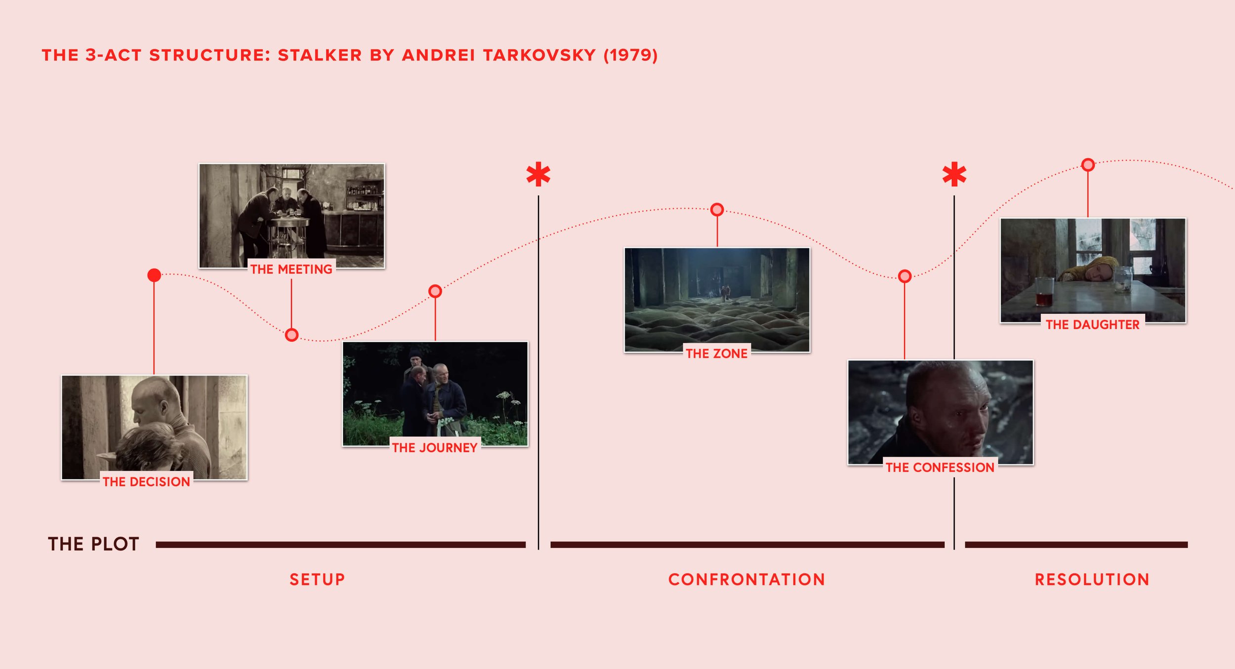
The 3-act structure of Stalker by Andrei Tarkovsky. An attempt to make sense of Tarkovsky's spellbinding technique.
By observing the above scheme, we can immediately understand some of the essential elements of Tarkovsky’s signature approach (signature, because the same approach is used in movies other than Stalker):
Elongating the first two acts for a contemplative experience. Renowned for its long, deliberate takes and meditative pacing, the film challenges viewers to slow down and fully experience each moment.
Open-ended resolution for interpretation. The narrative resists tidy conclusions, instead offering an open-ended finale that invites interpretation and introspection.
Emotional projection for viewer engagement. The dialogue between the protagonists is ambiguous, requiring the viewer to layer their own thoughts, feelings, and meaning onto the story (this is the 2+2 theory explained by Andrew Stanton, link to article).
There is an important UX lesson to take from these 3 points:
Andrei Tarkovsky’s approach teaches us the value of slowing down the user experience when appropriate, thus encouraging deeper engagement with content or features. By designing descriptive experiences that offer users space to explore and interpret, we can create journeys that feel more personal and impactful.
Let's, however, go deeper into this lesson with some realistic applications – because I don’t want to emulate Tarkovsky’s trademark ambiguity here!

Contrary to a common misconception, Stalker is not a black-and-white movie. Tarkovsky uses different color grading and filters throughout the film to create distinct visual moods corresponding to different parts of the story.
Application 1: The power of deliberate pacing
Here, we focus on the rhythm of narration. Just as Stalker's extended acts compel the viewer to notice details and reflect, slowing down certain UX flows can foster deeper user engagement.
Where to use this technique: onboarding processes.
Onboarding processes that unfold gradually, revealing content or features with intentional pacing, can help users better absorb complex information. As a result, they will feel less overwhelmed or distracted by too many walkthroughs, particularly when the intention is for them to simply start using the product.
For example, during my time at Kialo Edu, I redesigned the platform’s onboarding process to incorporate a personalised dashboard for students and teachers. While the customisation could be paused at any time, a checklist called ‘Smart Guide’ reminded users of the different features they could explore.

Kialo Edu’s onboarding process. Please note: the experience I designed was never implemented, but you can see some screenshots here.
Why does this technique work?
For tasks requiring quality time and thoughtfulness—such as onboarding, storytelling interfaces, or reflective content—design slower, more intentional flows that allow users to engage meaningfully with the content, rather than rushing them through.
Application 2: Designing for exploration
Stalker thrives on its lack of explicit answers, allowing the audience to become co-creators of meaning. In UX, embracing ambiguity can be dangerous, but this too can act as a powerful tool to engage users.
Open-ended interactions, such as exploratory interfaces, customisable workflows (most of the time non-linear), or features that adapt to user behaviour, encourage curiosity and creative exploration.
Where to use this technique: interface browsing.
Stripe has created an original experience to help collect data for their Black Friday/Cyber Monday (BFCM) transactions. Instead of merely providing a long list of numbers, it invites the user to explore a realistic HUD and a 3D manual.
The flow is non-linear, but the point-of-view is fixed on the machine and on the paper of the manual.
Fun note: The site itself evokes those interactive websites built with Adobe Flash back in the Noughties. :)

BFCM by Stripe. An original experience to help collect data for their Black Friday/Cyber Monday (BFCM) transactions.
Why does this technique work?
Allowing users to explore and create their own meaning, as with discovery interfaces or a discovery playlist on Spotify, provides frameworks rather than rigid workflows. This empowers each user to customise their own experience.
Application 3: Building narrative layers
Stalker’s layered storytelling—through which every scene is dense with symbolism and subtext—mirrors the design of rich, multi-faceted user journeys. The UX design of digital products can similarly benefit from layered experiences that reward repeated use or exploration.
Where to use this technique: content-heavy, one-page sites.
I have already expressed my appreciation for the Ahadi Foundation website on a LinkedIn post.
It makes me I wish I had designed a similar page for those organisations willing to let the user return for more. Certainly, creating an experience that depends on users re-visiting the website is a bold decision, but done well, it is a decision likely to pay off – just as it does here.
I think this site does a great job in creating a one-pager that includes myriad ways for users to engage with its content. This is presented through stories, programs and news, all in different formats including a CTA button, playful cards and more traditional UI cards.
While the animation can mean missing some links and interactive elements when scrolling, the most important information is always visible. By continually re-visiting the site, users meet a different experience each time, discover some rewarding animations (and information) along the way.

The Ahadi Foundation website. A one-pager that includes myriad ways for users to engage with its content.
Why does this technique work?
Create calls-to-action or interactions that intrigue users, instead of offering immediate gratification with a "Click Here” or “Read More” button. Adding a layer of interpretation hints at a rewarding journey rather than a stone cold transaction, making the experience more memorable.
Final thoughts
In recent years, my passion for storytelling has deepened, and I have learned a great deal from exceptional directors, like Tarkovsky, and their masterpieces. I will share a small portion of my analyses during The Power of Storytelling, though my hope is that we will review many other films together.
Today, we have learnt that Tarkovsky’s Stalker isn’t just a film, but an experience that powerfully reshapes how we think about time, space, and interpretation. In UX design, we can draw inspiration from this masterpiece to craft interactions that are more deliberate, immersive, and meaningful.
I have discovered that these parallels provide a greater understanding of how people interact with an experience. Even though movies are different from the work we do as UX designers, the influence of storytelling on our behaviour and thought processes is deeply ingrained in our brains. With some adaptation and thorough analysis, we can extract meaningful lessons and original ideas from them.
Did you enjoy what you just read? Subscribe to my Sunday Tales Newsletter!
The Sunday Tales is an initiative that was requested by many of the 2000+ students from my Domestika course. They wanted to know more about storytelling, but didn't know where to find the right information.
At the same time, I realized that many storytelling-related elements need to unfold clearly in my mind. Writing about them seemed like the ideal solution. That’s why I would be extremely grateful if you subscribed to this newsletter!
Your support will help Sunday Tales grow, and I hope you will always come away feeling informed and inspired.