KRAFT Paints' Chat with Color
KRAFT Paints is a Greek brand that sells an array of colors and products for both interior and exterior surfaces. Their new brand image has evolved significantly over the years to define their position as a leader in the industry.
With this in mind, they have chosen to incorporate the latest AI technology to develop a user-friendly and engaging search engine for their target audience.
Competencies
Art Direction
UI/UX Design
Design System
Photo editing


The Campaign on TV
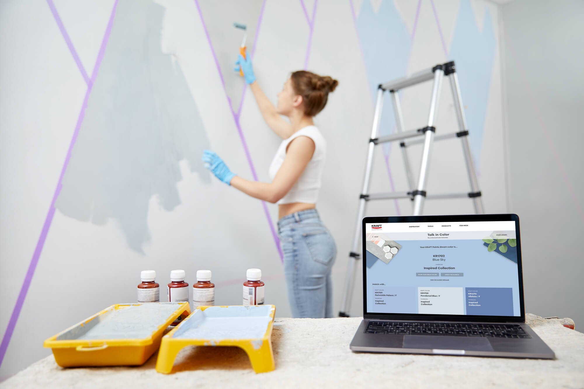
In an era where imagery transitions from the physical world to the digital, especially through social media, color gains even more significance. The new colour generator by KRAFT Paints, "Chat in Color", utilizing artificial intelligence, generates shades based on human inspiration and imagination.
It transforms words or phrases describing a shade or extracts colours from images to find the closest match from KRAFT Paints' fan decks.
This video illustrates the full experience as imagined for KRAFT Paints’ users.
The Project. The Story.
The Protagonists
KRAFT Paints has undergone a significant rebranding over the past few years. The company has shifted its focus to provide expert advice to interior design professionals, such as architects and the designers themselves.
In 2023, they launched a campaign called Talk in Color to emphasise the importance of color in our lives, and how it reflects our feelings and expressions.
KRAFT Paints has since joined forces with Valuedriven, a leading Greek tech company known for creating innovative tools. Together, they are harnessing the power of AI LMS tools to enhance the color search experience.
This advanced tool is designed to assist users in finding their perfect color – even for unsure users who can only describe an ideal color in words and images.
The Plot
I collaborated closely with Valuedriven to design the interface and overall user experience of a brand-new tool called Chat with Color, which will integrate into KRAFT Paints' existing website.
This tool is a more advanced follow-up to KRAFT's previous campaign, Talk with Color.
The product interface design starts by recognising that users often do not know the exact color they are looking for. However, they are able to describe it using words related to objects ("red like a ripe strawberry") or by finding matching images in magazines or on Pinterest.
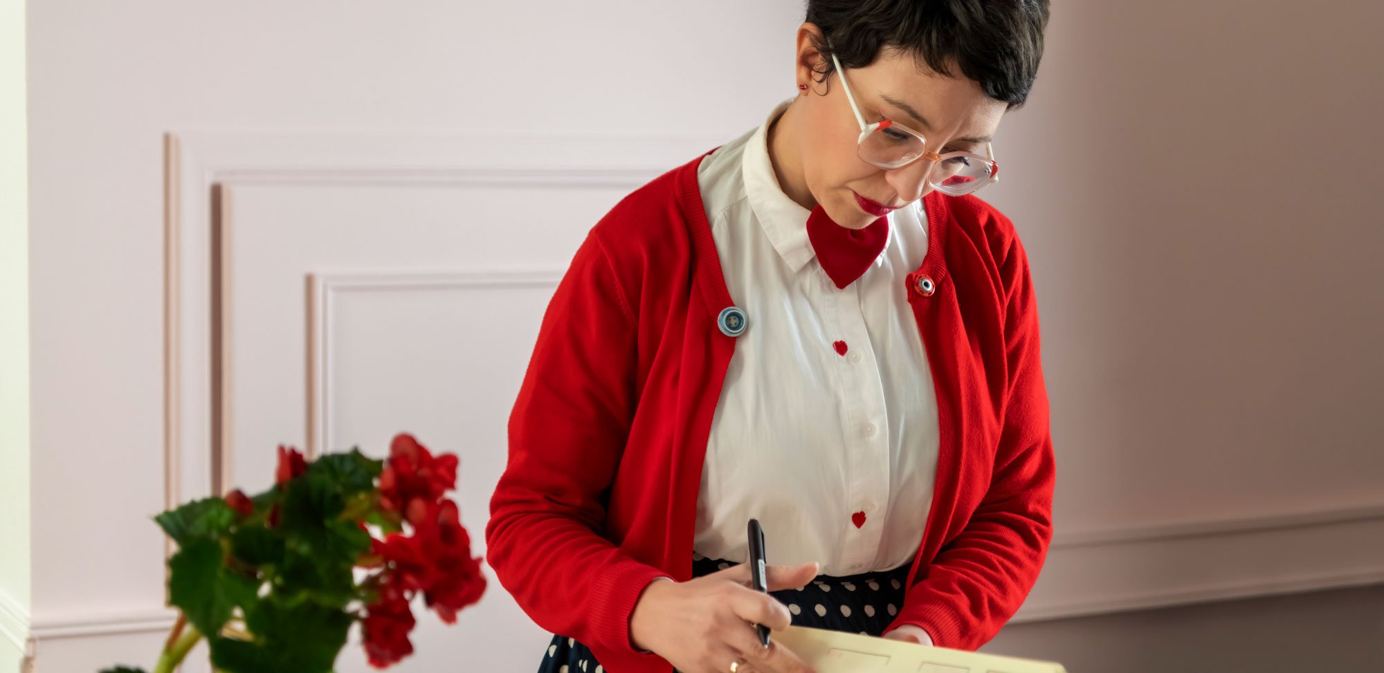
To design this experience, I drew inspiration from my early days as a designer in an architectural firm. I also relied upon personal experience, as I was renovating my own house and found myself trying to describe the color I wanted when visiting a KRAFT Paints reseller.
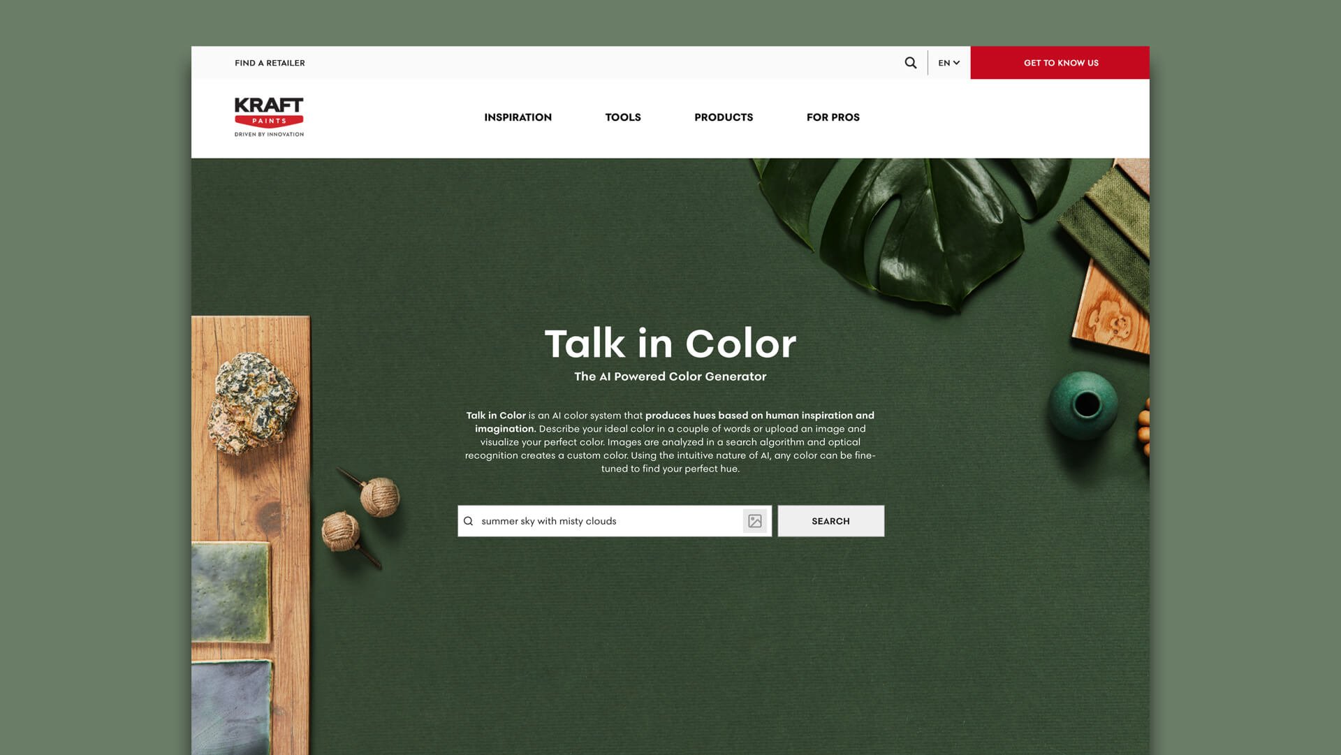
The user experience begins with a moodboard, crafted from olive oil colour fabric (a traditional Greek colour), natural elements (stone, wood, and ceramic) and decorative objects (leaves and fabric).
This is an experience that many people planning a home renovation may have faced: trying to match a new color to existing objects in the room. This is also the way many interior designers and architects work.
I have placed the search input field on this moodboard. Here, the user can easily describe their chosen colour (in either Greek or English), or upload an image.
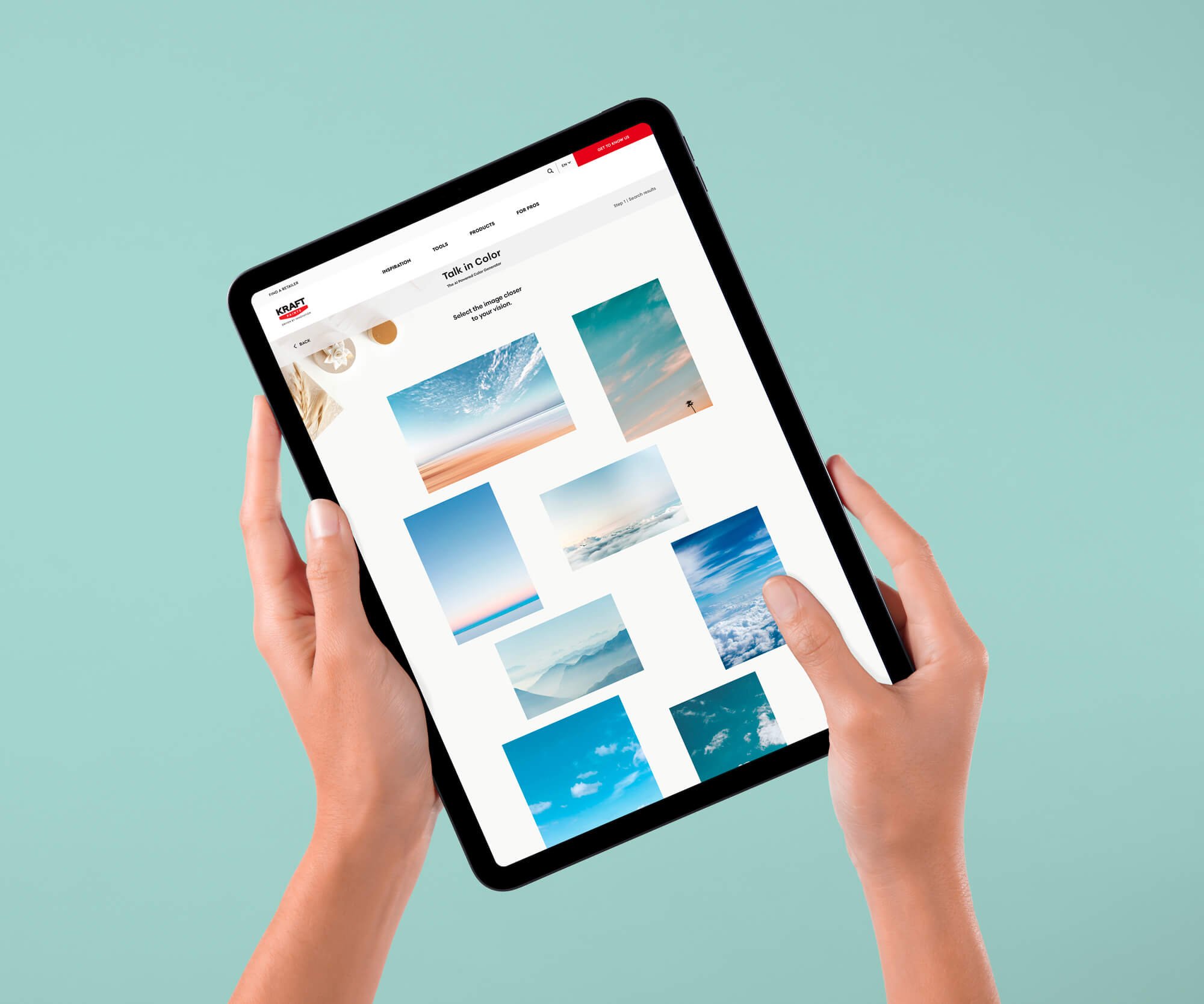
The ensuing search is powered by AI, which enhances the research and quickly provides matched images for the user to choose from.
The images are displayed randomly on a white background, similar to a collection of visual references on a wall.
By choosing the images that best fit their vision, the user gives AI another prompt that guides them to select a set of existing colors from the extensive Kraft palette.
Not only can the user pick the colour that best matches their vision, but they can also adjust it by submitting hints in words or playing with the color settings.
This is a playful, curiosity-led approach that also helps the user move closer to their vision. Moreover it is reassuringly similar to the user experience in any KRAFT Paints bricks-and-mortar shop, in which pigments can be added to a primary colour to create the desired result.
At the end of the experience, the user is presented with one colour code from the KRAFT palette, which is laid over a new, clean moodboard to emphasize its quality. They are also presented with additional matching colors that could inspire their final choice.
The Results
Chat with Color doesn't aim to replace the accuracy of choosing a color from the numerous Kraft Paints color swatches.
Instead, with its wide range of colors and shades the tool aims to assist users in finding words and images that can help them better articulate their vision and make more informed color-based decisions.
The tool was launched in March 2024, with a wide-ranging ad campaign that demonstrates KRAFT Paints' commitment to the color industry and its ongoing efforts to stay ahead of the curve.