

Design Patterns for AI Interfaces
Smashing Magazine is a leading resource for designers and developers, and the strong, vibrant community around it is held together by Vitaly Friedman — prolific writer, generous teacher, and tireless advocate for a more thoughtful web.
Vitaly and I have been working together for years now: we shaped Smashing Book 6, the launch of Smart Interface Design Patterns, and the sequel How to Measure UX.
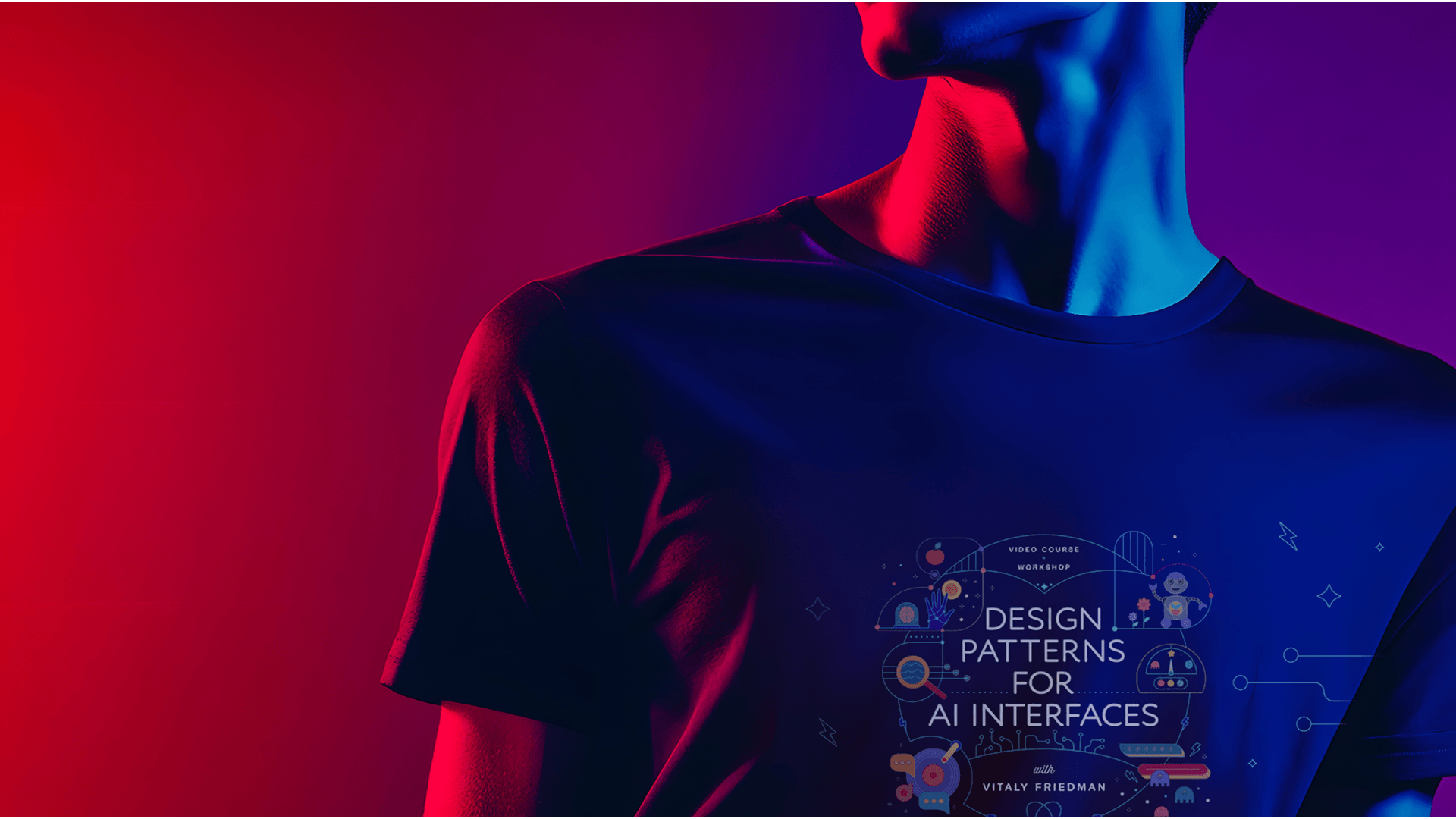
In 2025 he came back with a new mission and a new course, Design Patterns for AI Interfaces, and asked me to design its home on the web. The third chapter of a trilogy, and quietly the most ambitious one yet.
Competencies
Art Direction
UI/UX Design
Custom Illustrations
Narrative Concept Design
Visual Continuity & Brand Evolution
Animation Direction
Did you know?
For this AI course, I intentionally chose an arcade and 80s-inspired direction.
The 1980s were a defining era for artificial intelligence: when fresh discoveries and breakthroughs first captured the imagination of researchers and the wider public. It was also the decade when technology became truly accessible to everyday people, through the Walkman (1979), the VHS player (1983), the CD (1983), and early personal computers like the IBM PC and the Commodore 64.
That decade represents the excitement and curiosity that arise when new technologies start shaping everyday life, creating fresh ways for people to connect and interact.
That feels a lot like where we are with AI today.
By drawing from the bold, playful energy of the 80s, I wanted to frame AI not as something intimidating or distant, but as something familiar, creative, and approachable. This retro-futuristic theme encourages us to experiment, to tinker, and to see AI as a space for curiosity, where anyone can explore and craft their own ideas.
The Project. The Story.
The Protagonists
By now, Vitaly and I have developed a kind of design rhythm. Each course site we've built together is a chapter — and each chapter has needed its own world.
A kitchen full of UI "ingredients" for Smart Interface Design Patterns. A fluorescent UX laboratory for How to Measure UX. So when Vitaly came back with Design Patterns for AI Interfaces, the conversation didn't start with "What should it look like?"
It started with “Where is this one set?"
The brief came without an obvious visual reference, because there isn't one yet: AI doesn't have a settled design language, and the one that's emerging by default is cold gradients, sterile blacks and a lot of vague magic.
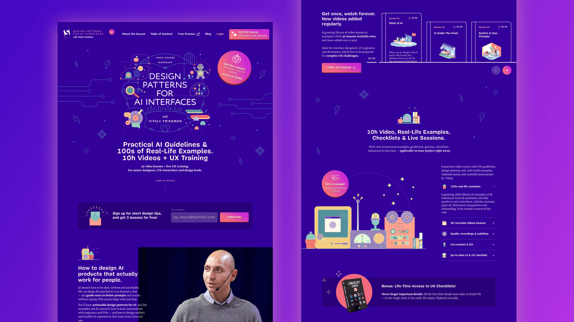
Vitaly's course is the opposite of that. It's a deep, careful body of work: 30 video lessons, ten hours of material, a 165-page reference deck, plus live UX training sessions, teaching senior designers, researchers and design leads how to actually build AI interfaces that are clear, fast, trustworthy and human.
The site needed to feel like a place where people are curious, not anxious.
The Plot
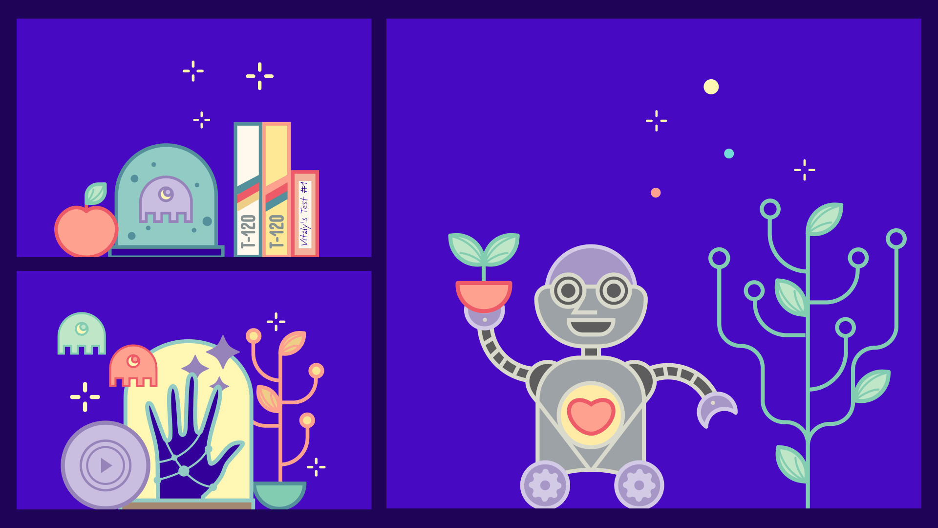
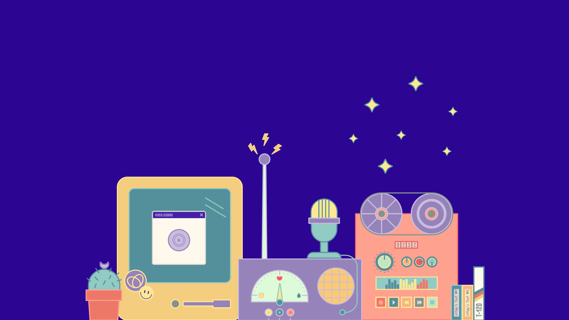
The visual world I built is part arcade, part desk-of-curiosities, somewhere between a Saturday afternoon at the local game cabinet and a designer's overstuffed studio shelf.
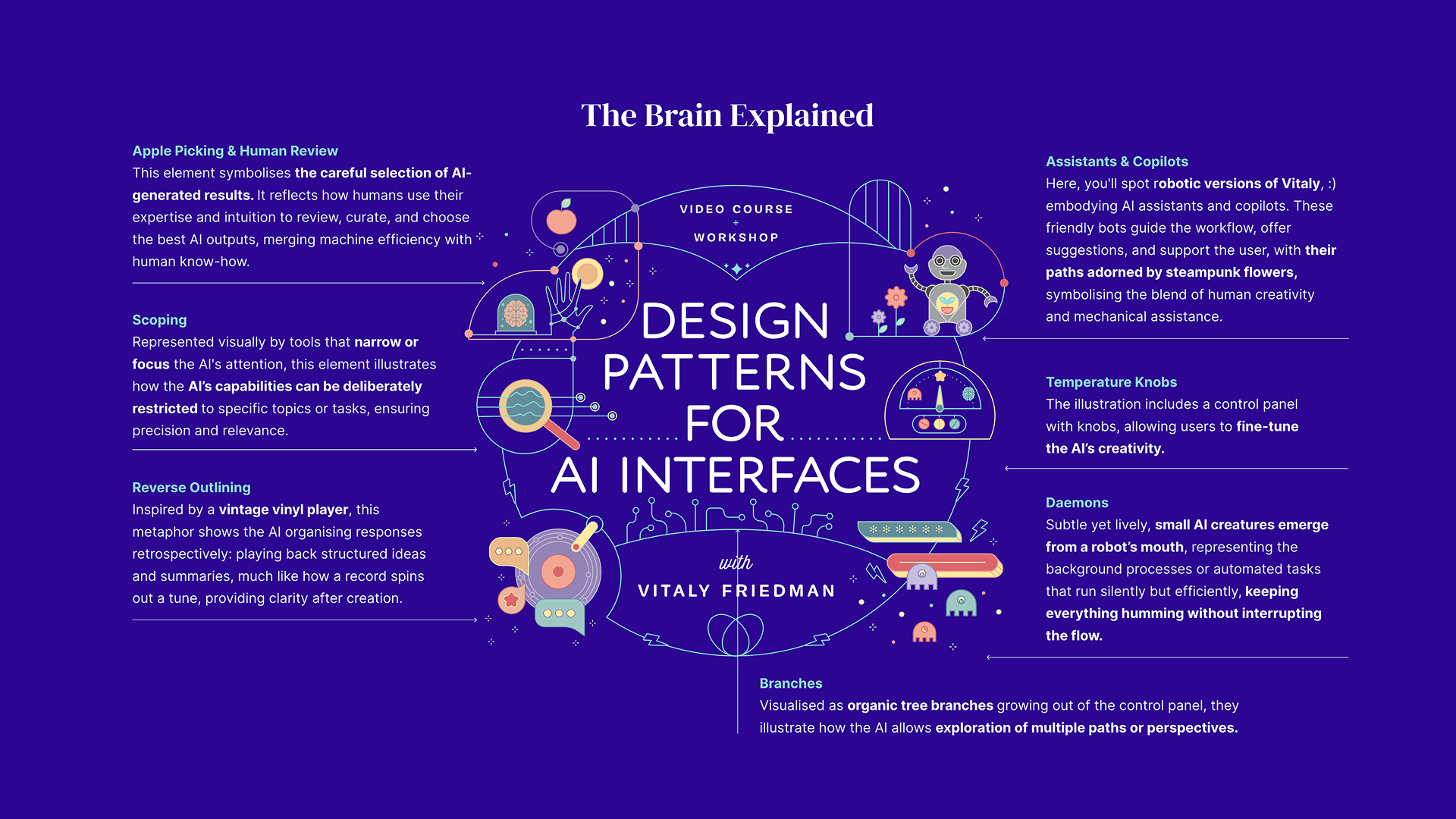
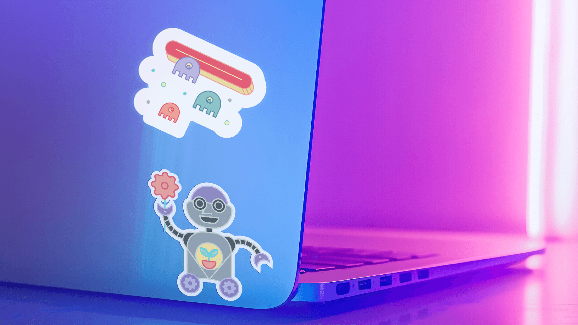
The illustrations carry the metaphor: a friendly robot, a record player, a brain held gently in a hand, a magnifying glass, a glass jar full of strange wonderful things, fruit, flowers, stars. Each object is an artifact from the moment when new technology stopped being scary and started being fun.
The colour palette is built around four warm anchors. A confident teal with the same UV-bright energy as a CRT screen. A coral-pink that feels like an arcade neon at dusk. A butter yellow that softens everything around it. And a deep, almost cosmic purple that gives the composition gravity.
Together, the palette is unmistakably 80s, but rebalanced: warmer than the era's usual primaries, softer, more inviting. The opposite of the cold gradients and sterile blacks that AI products almost always reach for.
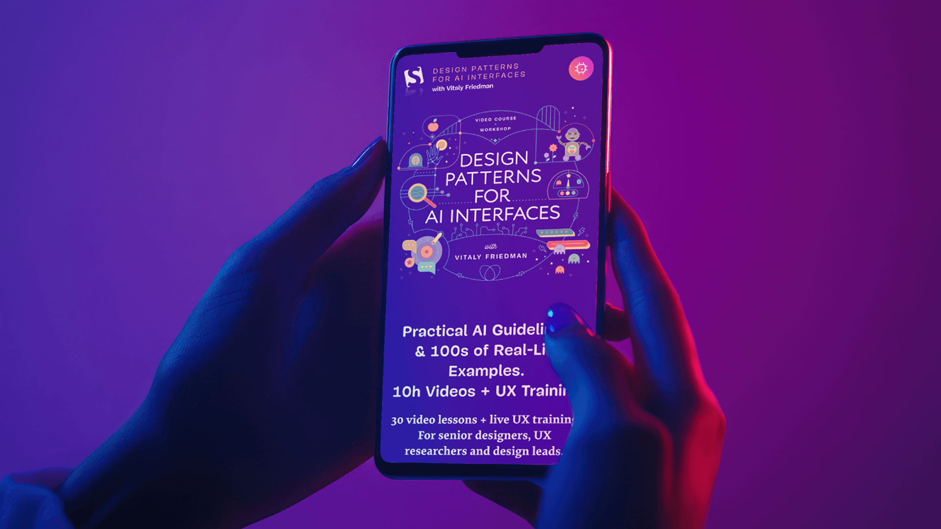
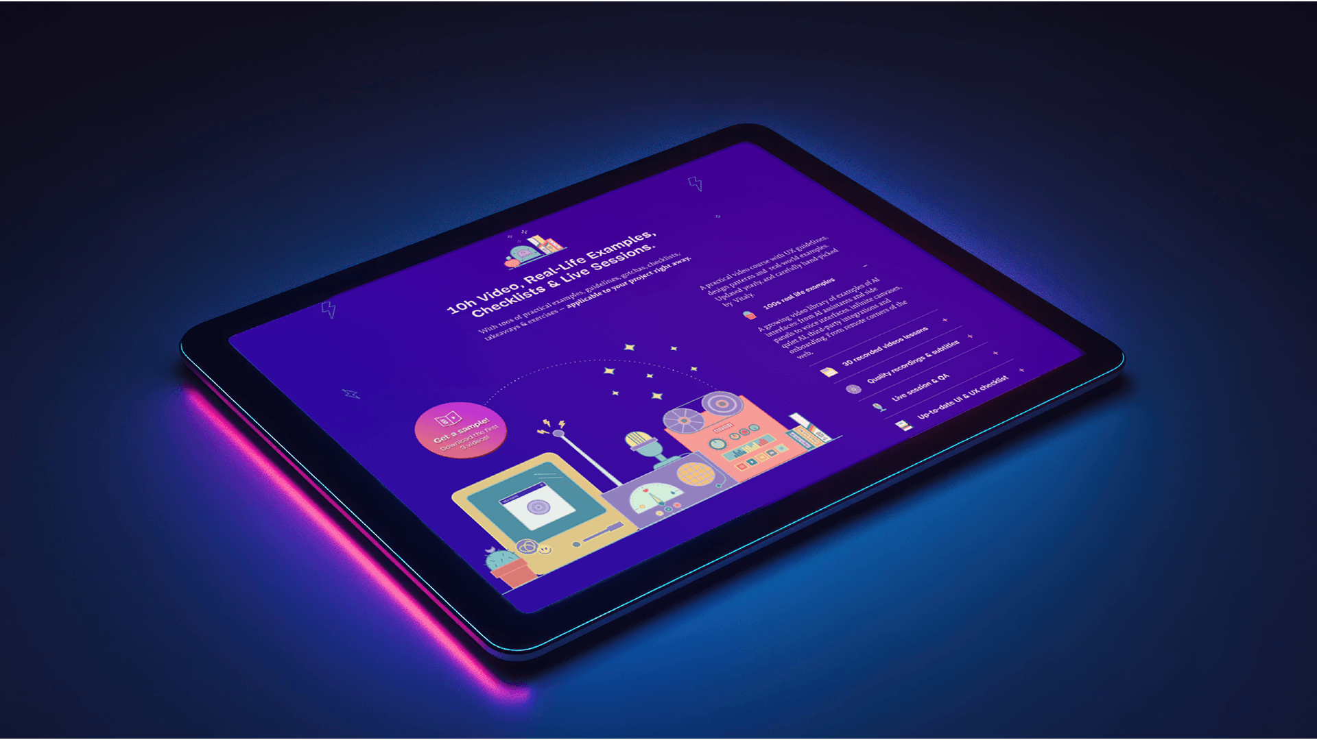
The page architecture keeps the scrolling rhythm and modular structure of the previous two courses. That continuity matters. A returning student should feel at home: the lesson grid behaves the way they expect, the pacing of the page is familiar, the navigation feels like a series. But the surface (the colour, the illustration, the texture) is unmistakably new.
Vitaly remains familiar, but evolves: from interface chef, to UX scientist, to AI explorer (the little robot has some familiar features!)
For the hero, I designed a single illustrated composition that gathers the whole world into one frame. It's the metaphor for the entire site distilled into a single image: AI as something you tinker with on your desk, the way a generation once tinkered with their first home computer.
The 30-lesson curriculum needed special care. Thirty cards in a grid can easily feel like homework. To keep the density inviting, each lesson card is paced like a small object on a shelf: clock icon, generous breathing room, a tactile little preview that makes ten hours feel like a collection worth opening, not a queue to grind through.
The Results
Tom Miller animated the illustrations, and the moment they started moving, the site stopped being a poster and became a place.
The flowers sway, the record spins, the robot blinks: the kind of motion that rewards a second look without ever asking for one. The animation concept and direction were mine; Tom brought the craft to make it sing. Charis Rooda then developed the site to pixel-perfect precision: fast, accessible, and faithful to the design at every breakpoint.
When the work came together, Design Patterns for AI Interfaces launched with the feeling I always hope for at the end of these projects: a site that doesn't just describe a course, but invites you into it.
It's the third chapter of a trilogy, and the one I most wanted to get right. The kitchen taught us how to design interfaces. The lab taught us how to measure them. The arcade is teaching us how to design with (and for) AI.
Same family, three very different rooms.