
How to Measure UX
How to Measure UX course is a direct sequel to “Smart Interface Design Patterns”; this project transforms the course website into a UX laboratory. Same narrative structure, new theme: Vitaly Friedman becomes a scientist exploring KPIs, testing hypotheses, and measuring real design impact, all in a modular, data-driven environment.
Competencies
Narrative concept design
UI design
Art direction
Visual continuity development
Design system


Did you know?
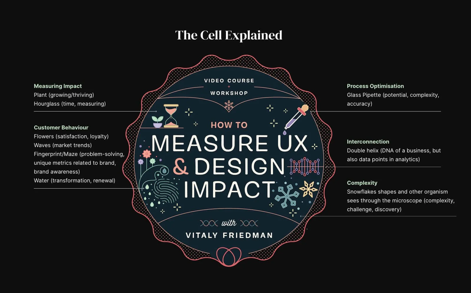
Each of Vitaly's courses features a central metaphor (a circular visual element) that defines the theme and sets the visual language for the entire site. In Smart Interface Design Patterns, it was a dish, referencing recipes, ingredients, and interface components.
For How to Measure UX, the central symbol becomes a living cell.
This "UX Cell" brings together all the core ideas of the course through visual metaphors tied to measurement, behaviour, and design complexity.
The Project. The Story.
The Protagonists
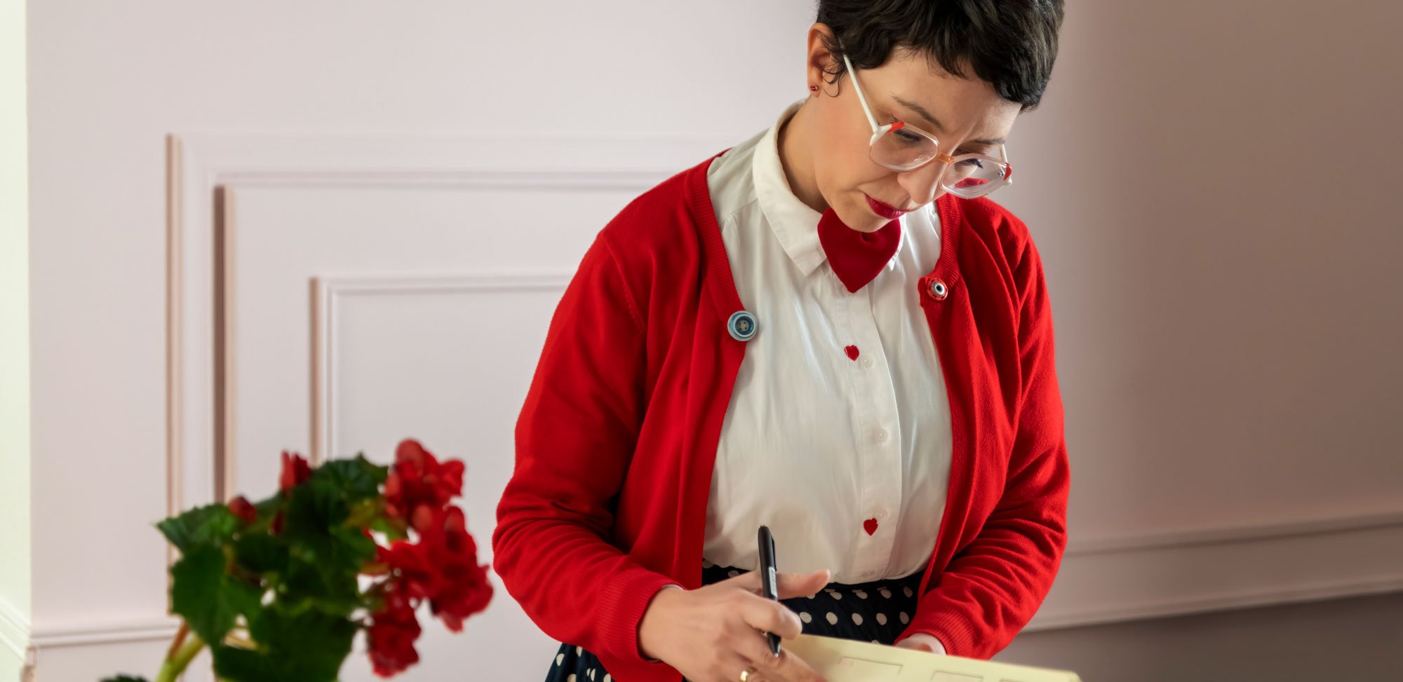
The new concept drove me to a scientific UX lab, where Vitaly transforms into a friendly researcher: lab coat on, clipboard in hand, running experiments on interfaces, metrics, and behavioural data.
Each section of the site becomes a station in the lab: flickering charts, animated DNA helix, live A/B tests with pipettes, and UI components under the microscope.
I evolved the style and energy of the previous course into a clean, modular, and slightly fluorescent environment, using visual metaphors to represent funnels, success rates, and test iterations, without losing the charm.
But this chapter has a more analytical and experimental tone than the previous one and a stronger brand presence.
The interface keeps the same layout and scrolling flow as the original.
Vitaly remains familiar, but grows: from interface superhero to UX scientist.
The tone stays human and friendly, even when discussing KPIs and ROI.
Graphics and animations support key ideas instead of just decorating them.
Following the first course, Smart Interface Design Patterns, set in a kitchen, Vitaly Friedman returned with a new mission: to teach how to measure UX impact through concrete data, KPIs, and usability testing.
The Plot
The Results
The new site is a direct sequel to the first one, designed to preserve visual and narrative continuity across the course series.
The result is a coherent and engaging experience that invites designers to go beyond aesthetics and start measuring what really works.