

#8. Storytelling with typography: Three lessons from the movie Elvis
While I’m not a big fan of Elvis Presley’s music, I recognise his seismic impact on the music world. I have always been curious about his life and his ascension to success.
So, when the flamboyant director Baz Luhrmann’s movie, Elvis, became available on Netflix, my husband and I decided to watch it. I liked it, but not because of the plot – or even the excellent interpretation of Elvis by Austin Butler. I liked it because of Luhrmann’s decision to award big, expressive, and colourful typography a starring role in the movie!
For this reason, I want to answer a pressing question: can we tell a story through typography?
Answer: Yes, we can!
Let's use the movie Elvis to introduce three essential lessons that we can learn and apply to our design projects.
Lesson 1: Typography as a "character" in the story
As with any product that relies heavily on the use of images, a movie focuses on conveying the idea of the product via visual illustration.
However, Baz Luhrmann decided to give typography a starring role, and it is placed in many parts of the movie to open scenes and set the specific mood of the following sequences.
For example, the font is lapidary: rigid, like “set in stone" in the scene where Elvis announces to his family that he has decided to go on a tour with the Hank Show. This is a pre-announcement of what happens next, in that he has set foot on a career path that will lead him to success – but one that will ultimately risk his happiness, his family, and even his life.

The font is lapidary. The scene where Elvis announces to his family that he has decided to go on a tour with the Hank Show.
The font shifts and changes, becoming more glamorous and sophisticated as Elvis finds success. This reflects not only the change in the plot (where money, deception, and greed become more and more obvious) but also the title that would come to define Elvis. The title of ‘The King’.

A more glamorous and sophisticated font is used toward the end of the movie.
Takeaway
Typography is a character in your story, so always consider font choices carefully, as they will reflect the personality of your page, brand, product or service.
Lesson 2: Typography can hold the plot together
Elvis Presley had a highly prolific music career. Watching a biopic about this, in which we doggedly follow his successive tours around US cities, would have made the plot not only long and tiresome but also very expensive to make!
In his movie, Baz Luhrmann used typography as an elegant shortcut to present the many different tours. In the beginning, the cities are presented as sleek postcards. This is because the tours were really like little outdoor picnics, where Elvis had fun touring with his band while discovering the world next door.

Postcards from US. Elvis' tours were really like little outdoor picnics, where Elvis had fun touring with his band while discovering the world next door.
As Elvis became more successful, the tours also become more and more frequent. How can we fast forward this aspect without losing plot momentum and engagement?
Bear in mind that by this point, we have already watched two hours of the movie and are at the end of Act 2, a very critical part of the story. Luhrmann must soon present the climax, or his audience will lose interest.
Again, typography comes in handy and appears quickly between different, brief shots. The typefaces used are different, and they all have different colours and personalities that represent the unique characters of the cities they display.
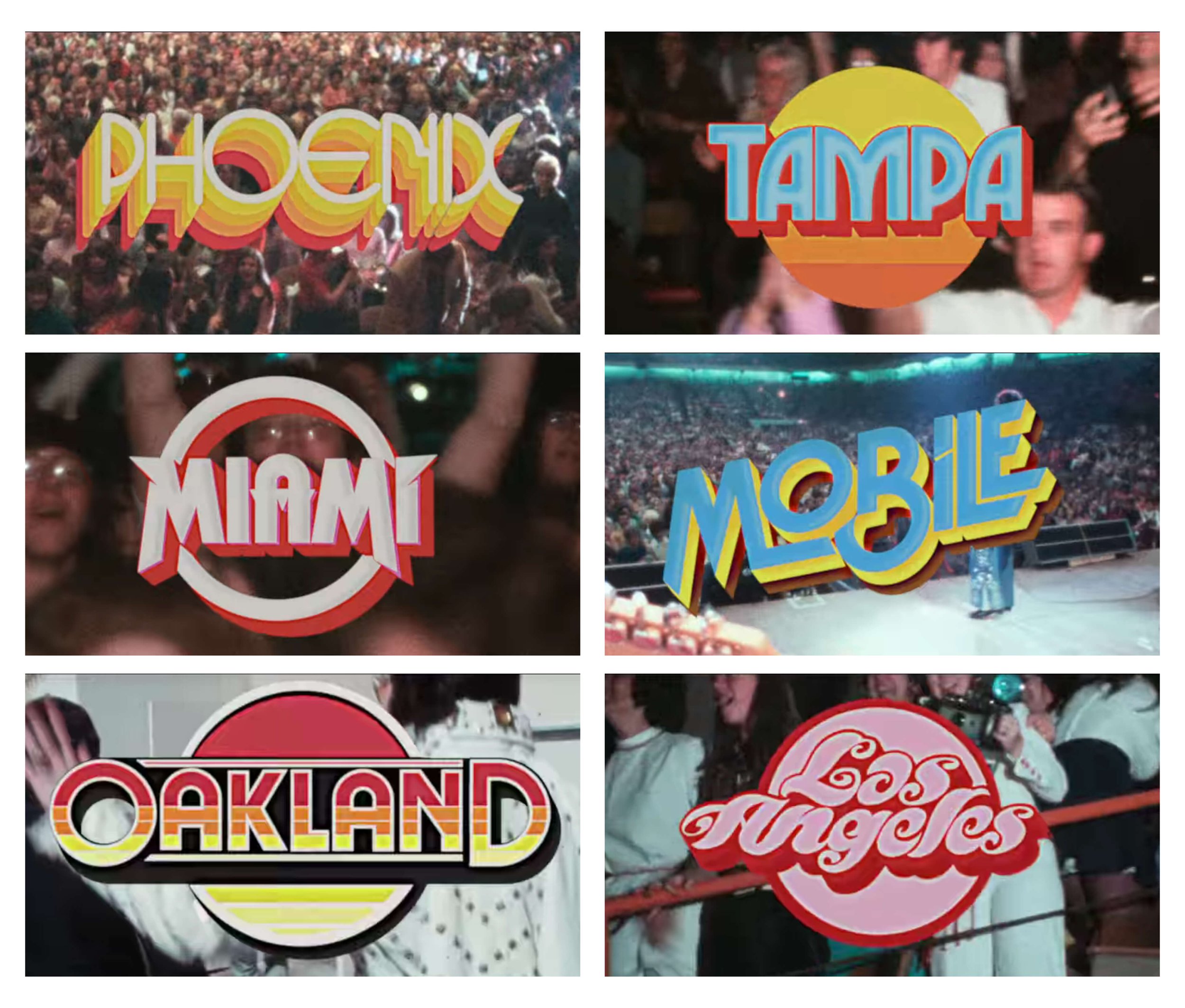
Fast forward the plot with typography. Some of the cities that Elvis toured and that in the movie are portrayed just through beautiful typographic elements.
Takeaway
Typography can be a descriptive, fun and engaging way to replace a set of images that would otherwise slow the narrative. Use it to inject diversity, memorability and novelty into places where others may rely only on images, illustrations and video.
Lesson n.3: Typography is a reflection of the context
The story of Elvis spans decades. Elvis Presley was a man of his time, and his success and decline were part of a wider change happening in the world.
Baz Luhrmann didn't want to transform Elvis's biopic into a documentary. Still, he wanted to explain the way in which the world was changing as his hero moved through it, and how the context he lived in influenced both his life and career.

The newspaper expedient. The world is changing announced as a newspaper headline.
For example, the story begins in the middle of the 1950s. This is the dawn of the advertising era, when the world is leaving the austerity of World War II behind. So there is a sense of richness and hope that pervades the families, expressed by the presence of new-fangled consumer products.
During this time, typography is used everywhere (more than images) because it is a cheap, easy to implement, and impactful way to sponsor products and their brand.
This is obvious in the amount of product-related typefaces that appear everywhere in the movie, from cars to walls.

The dawn of the advertising era. The super colourful and decorative typeface in 1950, from vans to walls, represents the post-war consumerist era.
The typeface is also what delivers bad news that makes it into the newspapers. It influences how Elvis became a much-feared singer by the authorities, and explains how Colonel Tom Parker persuaded Elvis to avoid embarking on an international tour for “security reasons”.

Bad news from the world. The fonts are more sever and geometric.
By the end of the movie we have reached the 1970s. Now, the only font visible is that of the International Hotel, where Elvis was confined during the final years of his career.

It ends with just one typeface. The world of Elvis shrunk inside the hotel in Las Vegas, where he performed his shows for many years.
Takeaway
Typography is always a reflection of the context it has been created and used for. Where you want to set the context, don't rely just on colours, images and illustration. Let the typeface set the story in the right time to add relatability.
My final thoughts on typography
Typography is a versatile and multi-faceted storytelling element worth every designer's attention. It not only helps us tell a story, but can also increasingly improve the accessibility of our narrative and drive user attention by setting a hierarchy.
If you’d like to read more about the way fonts can influence us and our perception, here’s an article I wrote, inspired by a talk I gave at the ICTV Conference in Thessaloniki, Greece.
Have fun reading it – and doing the quiz!
Did you enjoy what you just read? Subscribe to my Sunday Tales Newsletter!
The Sunday Tales is an initiative that was requested by many of the 2000+ students from my Domestika course. They wanted to know more about storytelling, but didn't know where to find the right information.
At the same time, I realized that many storytelling-related elements need to unfold clearly in my mind. Writing about them seemed like the ideal solution. That’s why I would be extremely grateful if you subscribed to this newsletter!
Your support will help Sunday Tales grow, and I hope you will always come away feeling informed and inspired.