Tosca Opdam
Tosca Opdam is a Dutch violinist whose presence in the classical music world goes far beyond performance.
She moves seamlessly between solo engagements, directing festivals, and initiating creative, cross-disciplinary projects. From the moment we met, it was clear that her personal vision would be the compass of her brand identity.
What I needed was to understand not just how she plays music, but why she plays it, how she thinks about collaboration, tradition and innovation, and what she wants the world to experience through her work.
Competencies
Brand Identity
Brand consultancy
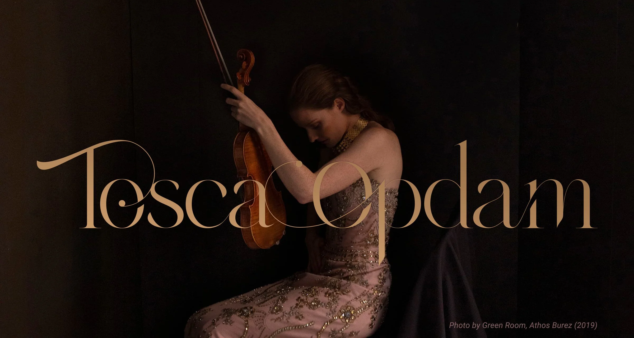
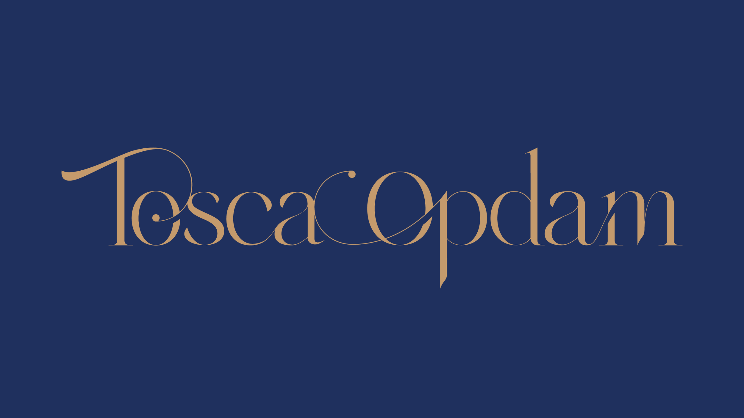
A Musical Logo
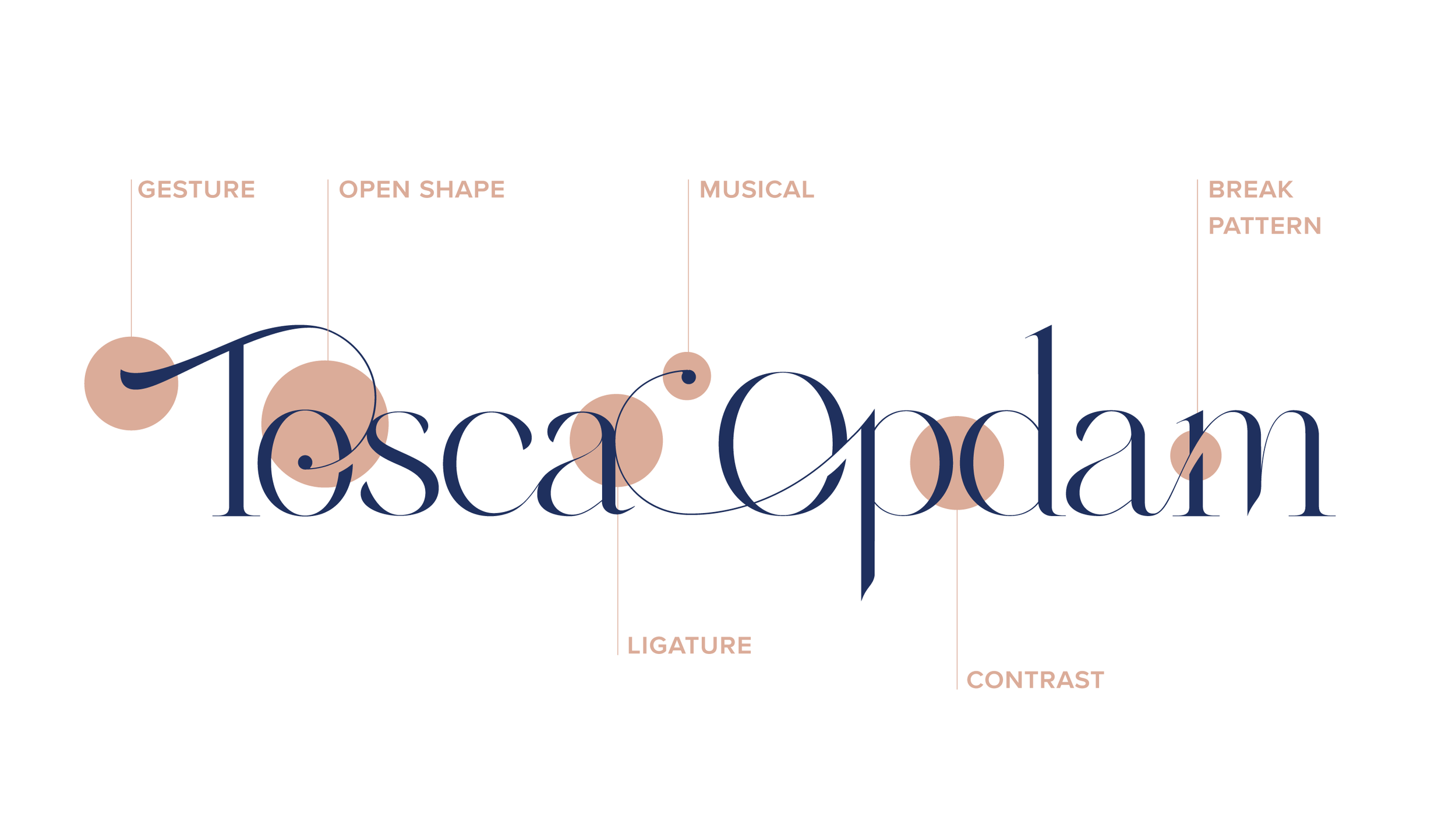
A key insight of this project was the idea of creating a musical logo, something that feels as if it could belong inside a score.
At the heart of the logo is a bespoke uppercase “T”. It captures the fluid, deliberate gesture of a violinist in motion, a reflection of Tosca’s presence on stage, the way her hand moves through the air to shape sound. In its form, it recalls a violin scroll, uniting symbol and instrument in a single, elegant gesture.
Likewise, the open shapes of the letter “O” were intentionally designed to convey openness and curiosity, a visual metaphor for Tosca’s creative approach, her readiness to explore and collaborate.
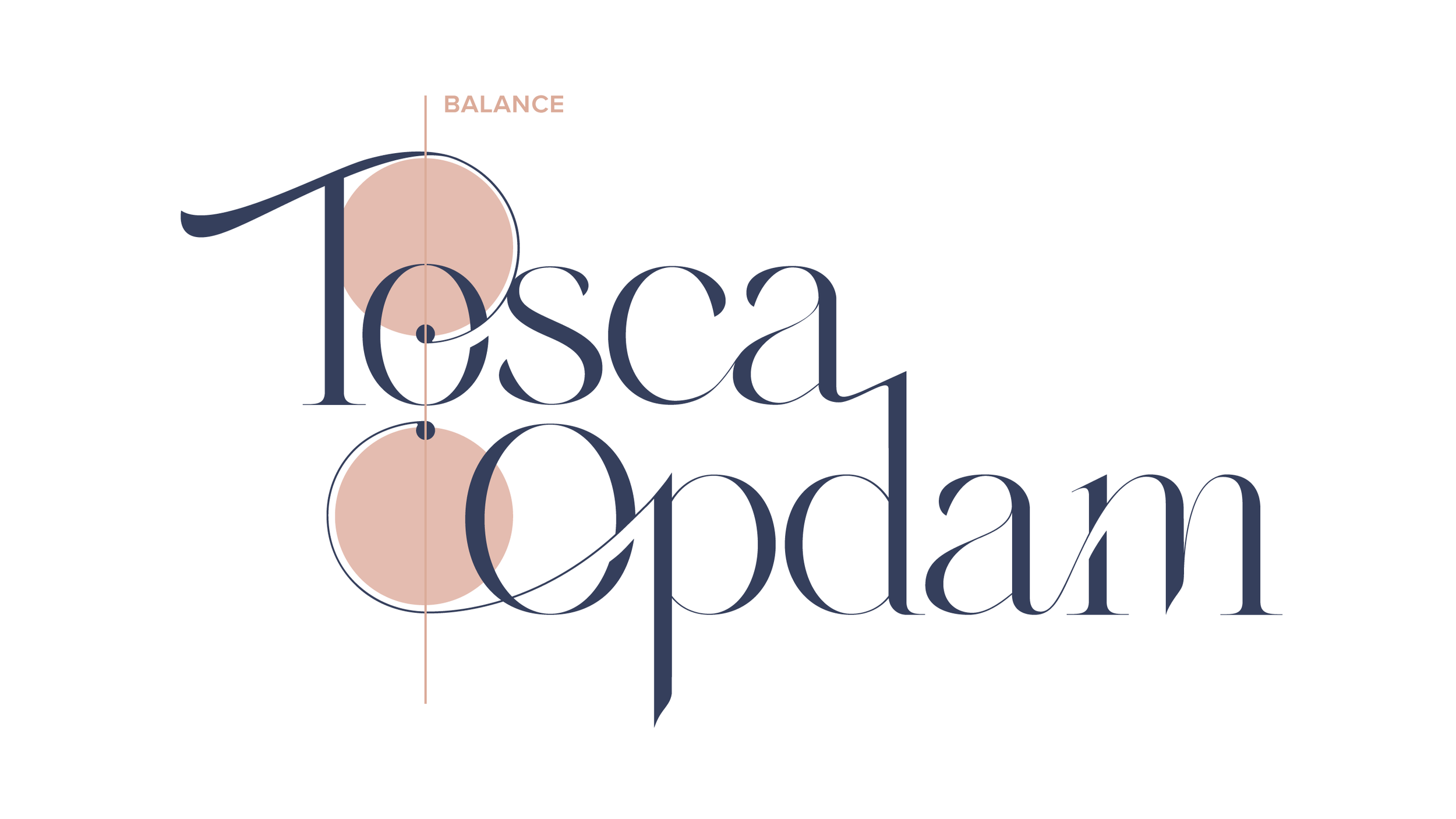
In the horizontal version of the logo, a ligature links her first and last name, a visual rhythm that speaks to continuity and connection, much like a musical phrase that unfolds without pause.
The vertical lock-up carefully aligns small dots that draw inspiration from repeat signs in musical notation, suggesting cyclical exploration, a fitting metaphor for creativity that revisits themes while discovering new depths.
The design we arrived at incorporates references to musical notation, ligatures and rhythmic points that echo the flow and expressiveness of a composition.
The Project. The Story.
The Protagonists
Tosca Opdam is a renowned Dutch violinist and artistic director of the Athens International Music Festival in Greece.
What strikes you when you see her on stage is not only her technical mastery. It is her presence: a vivid, fresh energy that lives comfortably within centuries-old music.
When Tosca approached me, I told her something very honest: “I admire what you do, and I want every one of these qualities to live inside your identity”.
The Plot
Our collaboration began with conversations about Tosca’s repertoire (Debussy, Prokofiev, Janáček) and how she bridges the familiar and the unfamiliar in her performances.
I wanted to listen with her ears, to recognise structures and rhythms, to sense how music unfolds over time. If a logo could feel like a musical experience, this one had to begin in that conceptual space.
From these discussions emerged a guiding tension: Tosca’s identity needed to honour the depth and gravity of the classical tradition while expressing a contemporary sensibility. This was more than aesthetics; it was a strategic design challenge.
She also shared references from artists across disciplines — from sculptors to fashion designers — all modern and rich in subtlety and refinement. These influences shaped the identity in a direction that was understated, yet unmistakably contemporary.
Designing this identity meant integrating her artistic universe. The outcome had to feel cohesive across the many contexts she inhabits, from performance programmes and festival branding to collaborations and educational initiatives.
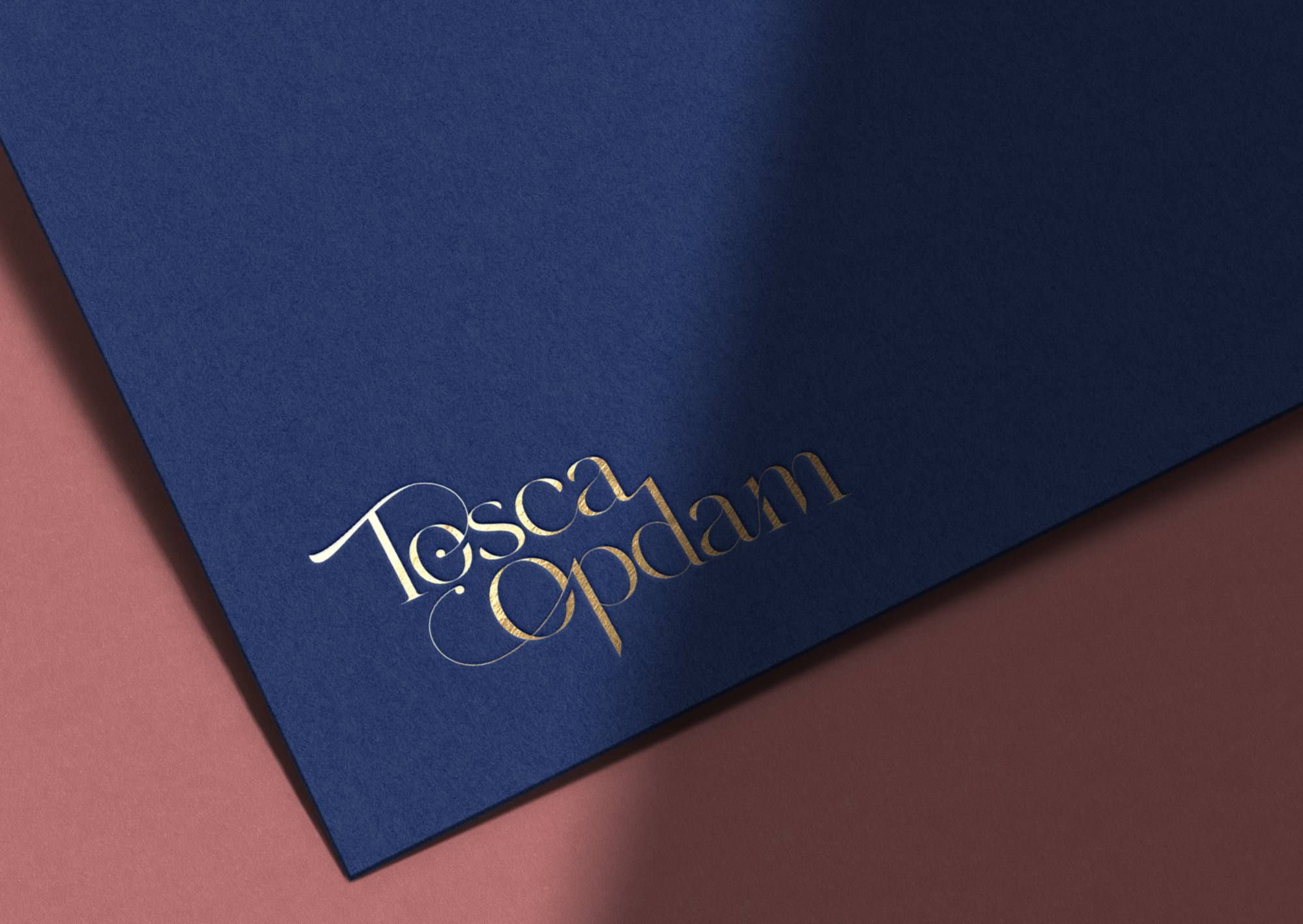
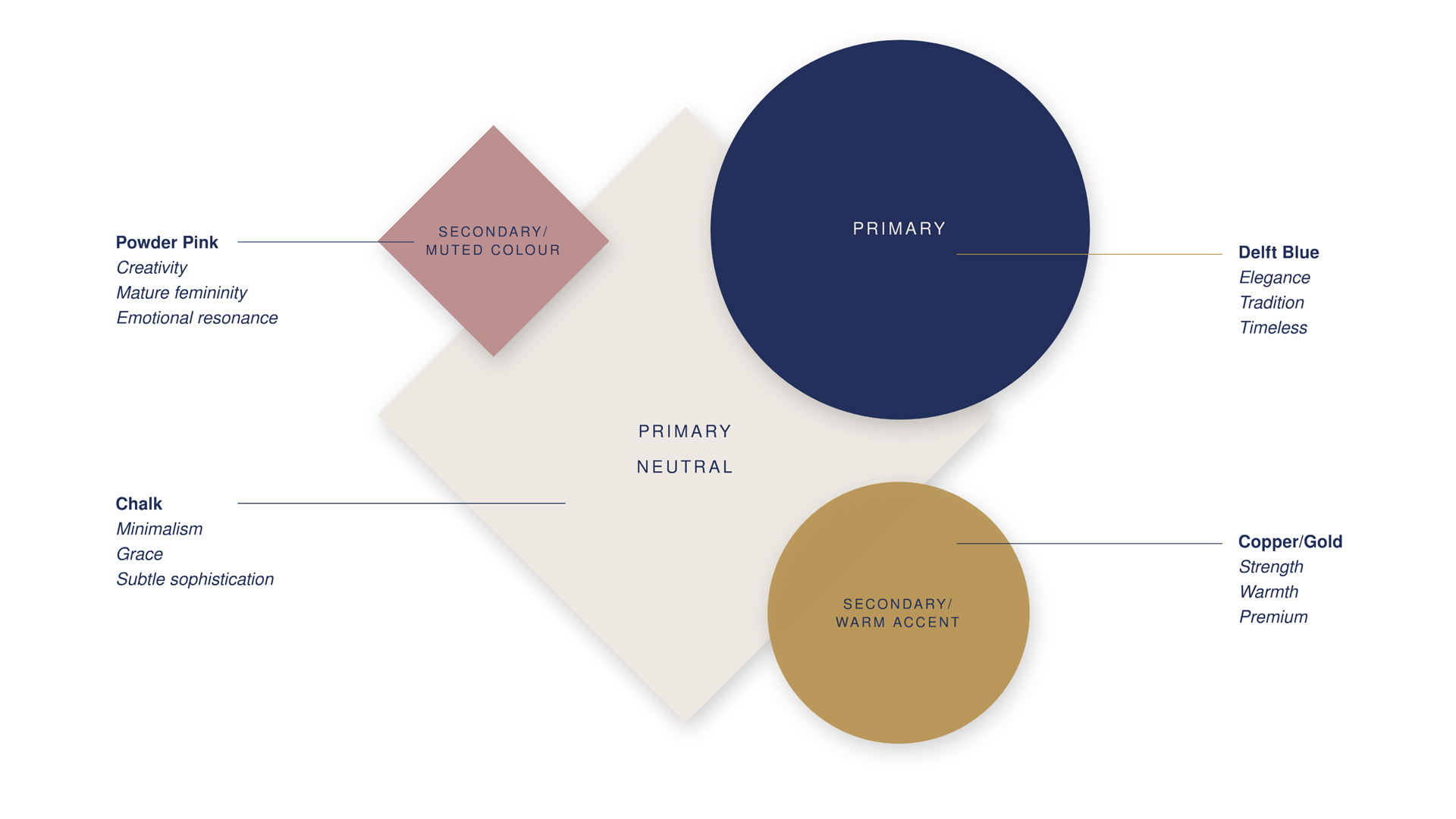
Colour in branding is never accidental. With Tosca, we chose a palette anchored in Delft Blue. This hue resonated on multiple levels: it speaks to her Dutch heritage, evokes a timeless quality akin to the classical repertoire she cherishes, and provides a thoughtful counterbalance to more modern design elements.
To keep the palette inviting and expressive, I introduced warmer accents like gentle pinks and chalk whites, layering human warmth over classic restraint. A metallic copper was added for premium printed materials, subtly elevating the overall expression without overwhelming the design language.
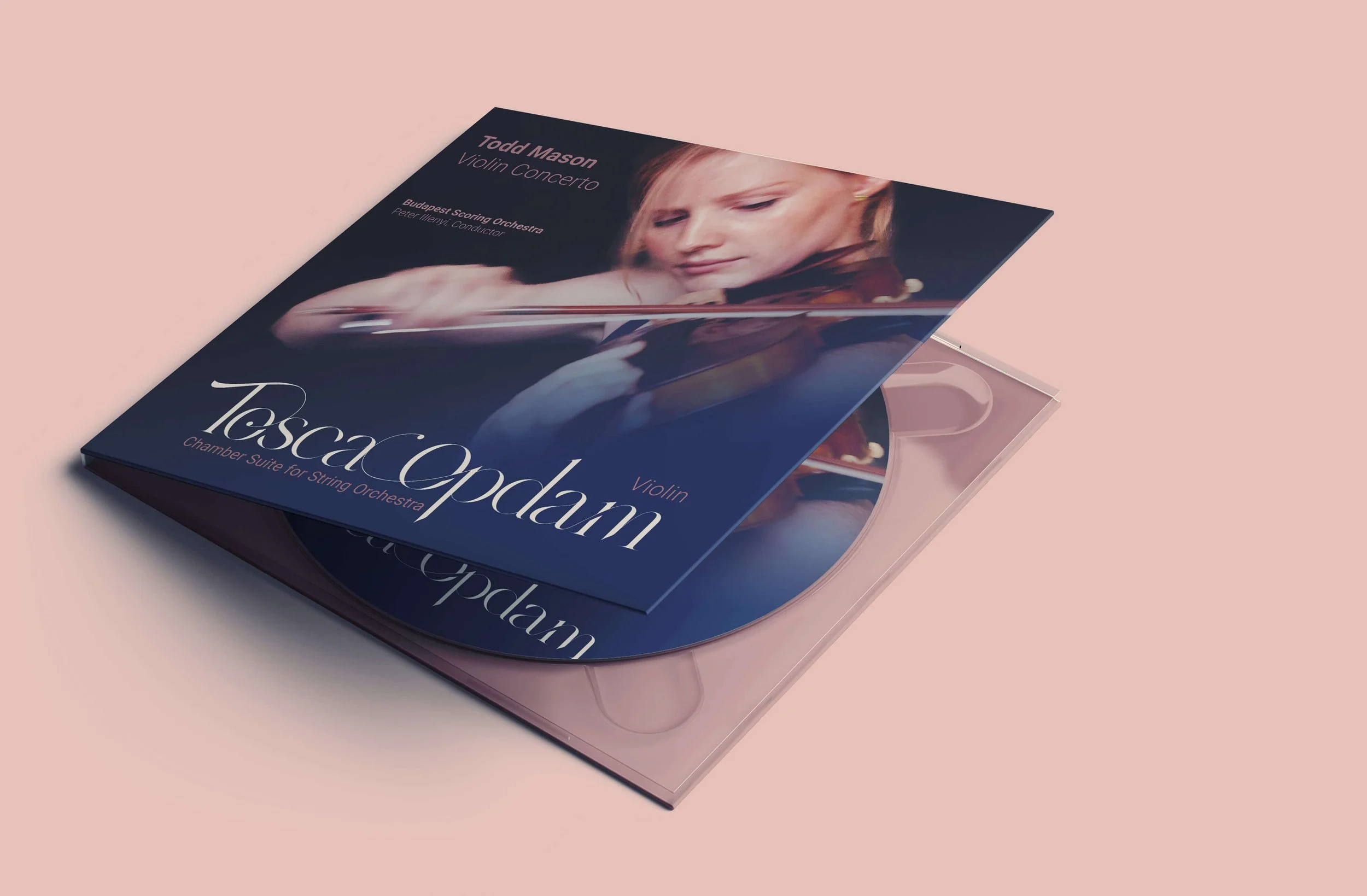
The Results
To help Tosca connect with the new identity beyond sketches, I developed a series of visual renders. These examples demonstrate how the brand functions in real contexts.
The identity is refined and elegant, but it also feels dynamic and adaptable.
The new identity of Tosca Opdam was unveiled in January 2026, marking both a celebration of her artistic journey so far and a statement of intention for the future.
