ActionAid Hellas
ActionAid is an international not-for-profit organisation, whose humanitarian work spans the globe.
Famous around the world for its child sponsorship programme, which involved individual donors sponsoring a child in a Third World country to help support their future, ActionAid has since evolved.
Today, the organisation has changed its mission, aiming to make a true global impact by actively working towards a world free from poverty and injustice.
Competencies
Brand strategy
Brand design
Brand consultancy
Illustrations
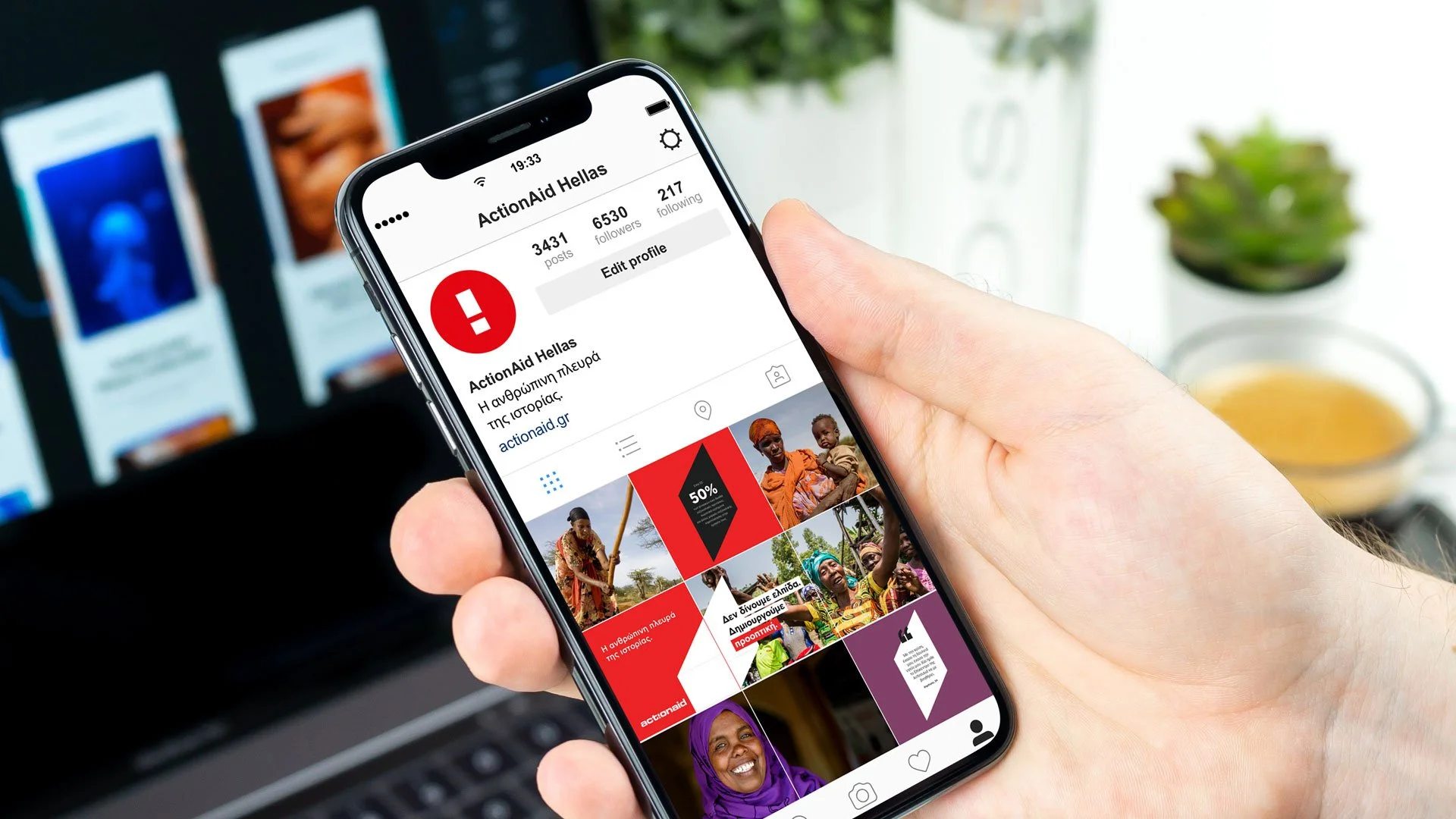
Brand Digital Communication


The Project. The Story.
The Protagonists
Active for over 20 years, ActionAid Hellas (AAH) is one of the oldest local branches of ActionAid International. Although it follows the joint mission of the international organisation, AAH has started to recognise the demand for national focus, as Greece can be defined as a country in need.
AAH's inward mission became even more focused when Greece was hit by the economic crisis of 2010. This was followed by the immigration crisis of 2018, which brought so many refugees (and sadly, corpses) to Lesvos' shores.
In light of this significant mission shift, AAH decided that new brand architecture and effective communication were needed to promote and support its activities in Greece.
The Plot
Together with the brand strategist, Zozetta Miliopoulou, we successfully ran a 2-day remote workshop with different departments in the organisation.
The workshop evidenced that, for many years, AAH faced crucial challenges in communicating its brand effectively.
During our workshops, I challenged board members and different teams with my favourite exercise, the Onliness Statement made famous by Marty Neumeier.
Based on the answers, we agreed that the organisation was connected to just one crucial value: change.
Stood alone, the word 'change' is open to many different interpretations and directions. So, for AAH, I 'contained the change' by creating a framework defined by four devolved values.
Looking at their past marketing campaigns, it was unmistakably evident that AAH's communication failed to encapsulate any of the four values of change agreed upon.
We needed something more inspiring and visually compelling, that could represent the values AAH extols within.
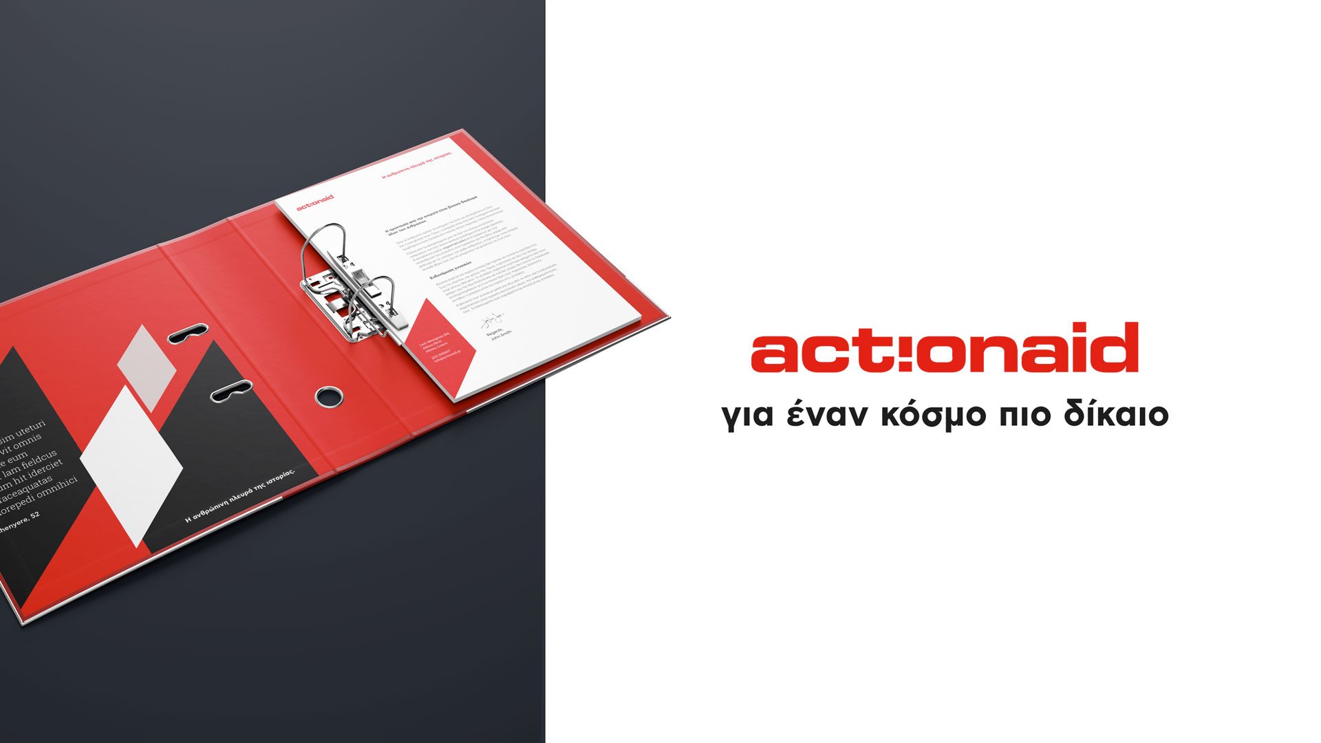
I therefore introduced a new graphic element into AAH's existing identity, the Sidelight, around which visual elements would create more dynamic, memorable, and powerful synergy.
Today, the Sidelight is the most distinct and ownable asset of AAH's identity. It represents the ability of the organisation to be an enabler of change.
The creative team and I worked extensively on the creation of a brand manual to define what we termed “a controlled freedom". This is an environment in which all collaborators (internal and external) could feel inspired, but also guided to create a strong and consistent message for the organisation.
The brand manual defines how the Sidelight relates to other elements of AAH's identity, like the redesigned areas of intervention, the reviewed colour palette, and the new typography.
Finally, the core brand values of 'change' also guide artists to create ad-hoc illustrations for AAH, that allow certain flexibility and consistency.
The Results
The new AAH brand identity is a tangible expression of everything the organisation stands for. It was successfully launched in July 2020.
Since then, the new identity unifies each different aspect of the brand, in a distinctive voice that aims to engage and involve a larger audience.
The client says:
The new brand identity denotes, unifies and differentiates us!
-Aspasia Kakari, Director of Communication
