
Hanim Boutique Hotel
Chania is a beautiful town on the iconic island of Crete in Greece.
Despite being heavily bombed during World War II, the Old Town is still picturesque and preserves its rare architectural treasures.
One of them is Hanim, an elegant boutique hotel just a stone’s throw away from the old harbour.
Competencies
Brand strategy
Brand design
Brand consultancy
Illustrations for rooms


The Project. The Story.
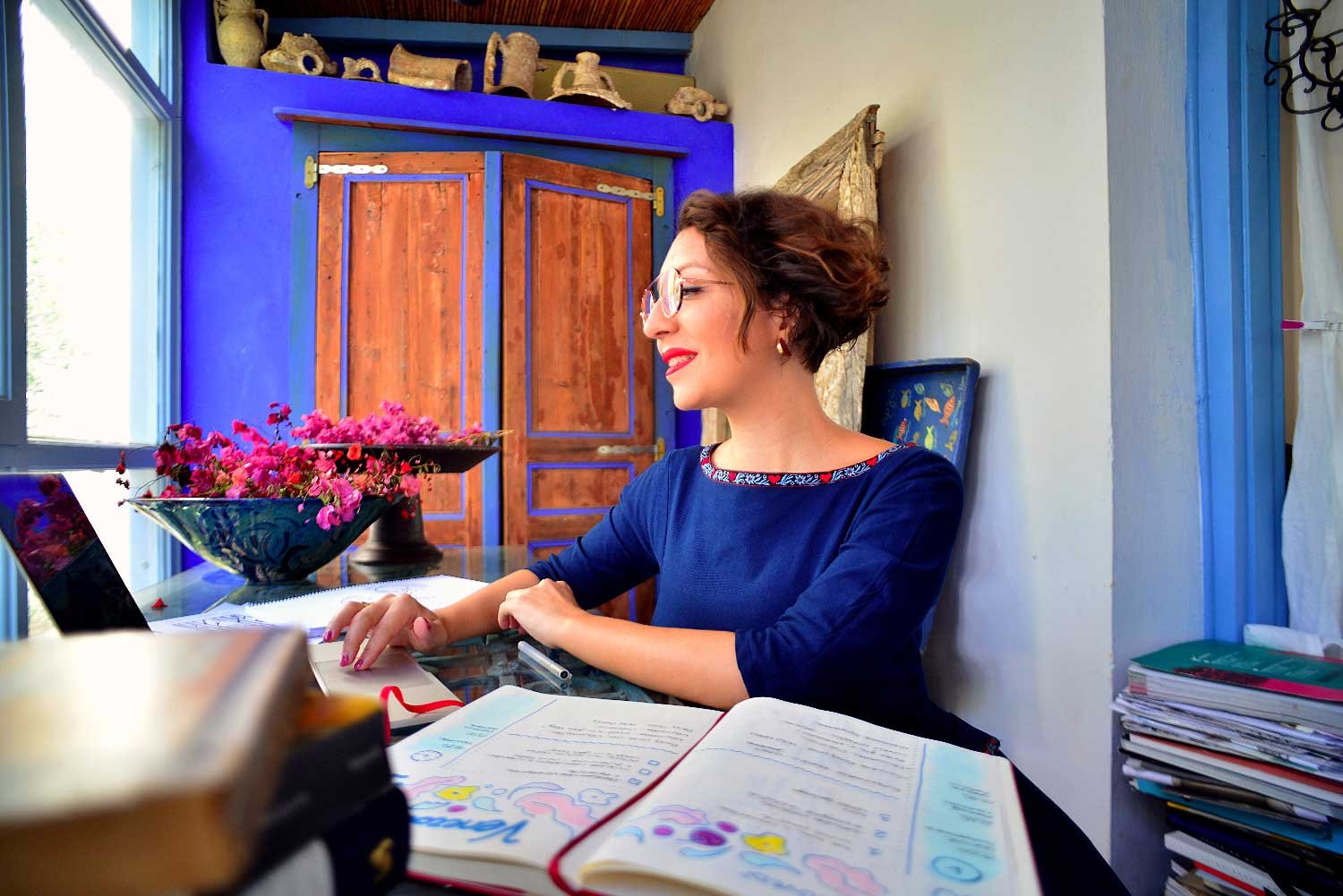
The Protagonists
Rena and Mantò are two sisters that have mastered the art of hospitality really well, turning Hanim into a place where their guests look forward to coming back again and again.
Hanim is a simple and elegant hotel in the heart of Chania's Old Town. The facade is really characteristic with its wood "sachnisi", a small protruding area supported by wooden beams, a heritage of the Ottoman architecture.
The seven rooms are elegant and simply furnished and take their names from Greek native herbs.
The Plot
Rena and Mantò explained to us that the name "Hanim" means "woman" in Turkish, but it also refers to the old name of the city when it was under the Ottoman Empire.
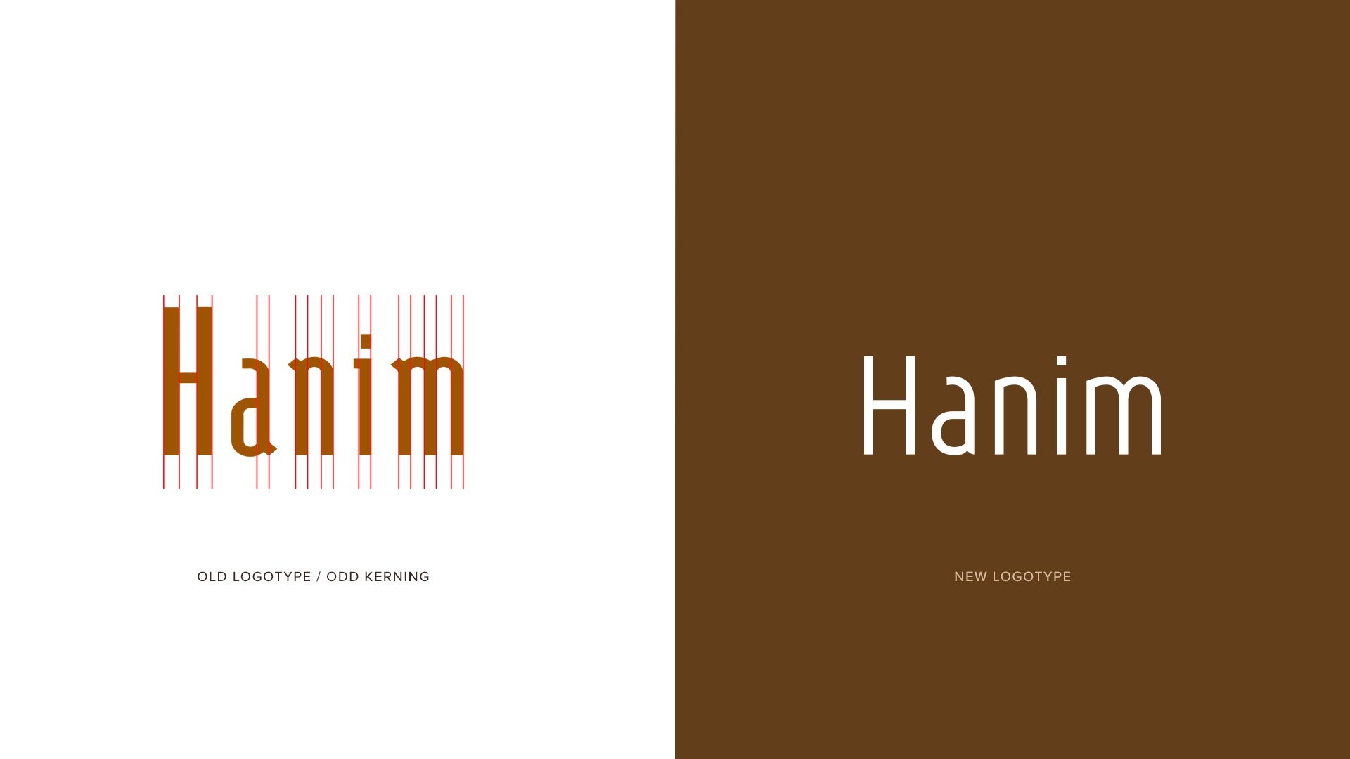
My first step was to redesign the existing logotype. They felt it was not fully representing their ideas of Hanim. I redesigned the font, removing unnecessary serifs.
I increased the kerning and enlarged the letters to optimise legibility in cases where the logo is reproduced small. I reduced the height of the capital H to create a more harmonious and gracious design.
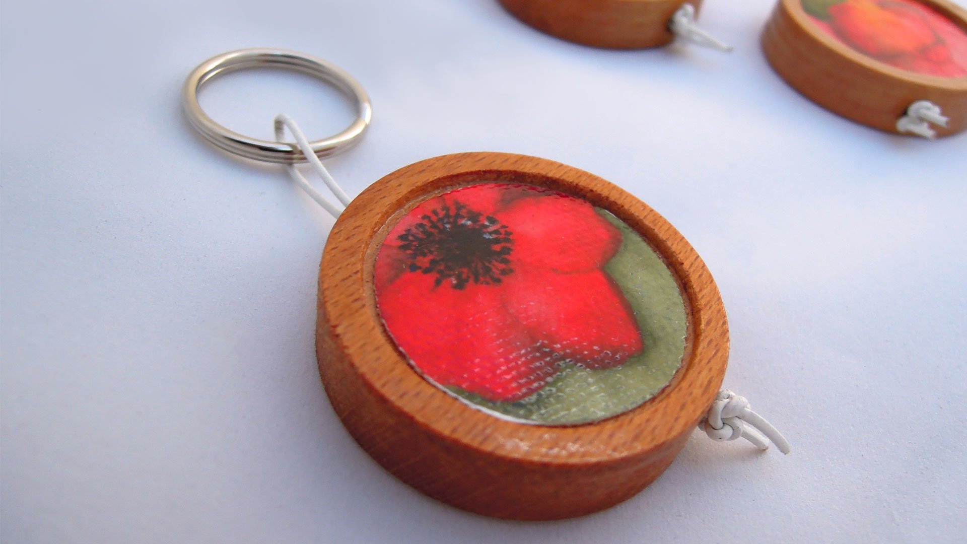
The concept of the seven herbs was my roadmap and inspired me to design a personality for each room.
My husband Spiros painted each herb using watercolour technique on bamboo paper. Based on these paintings I put together seven different colour palettes.
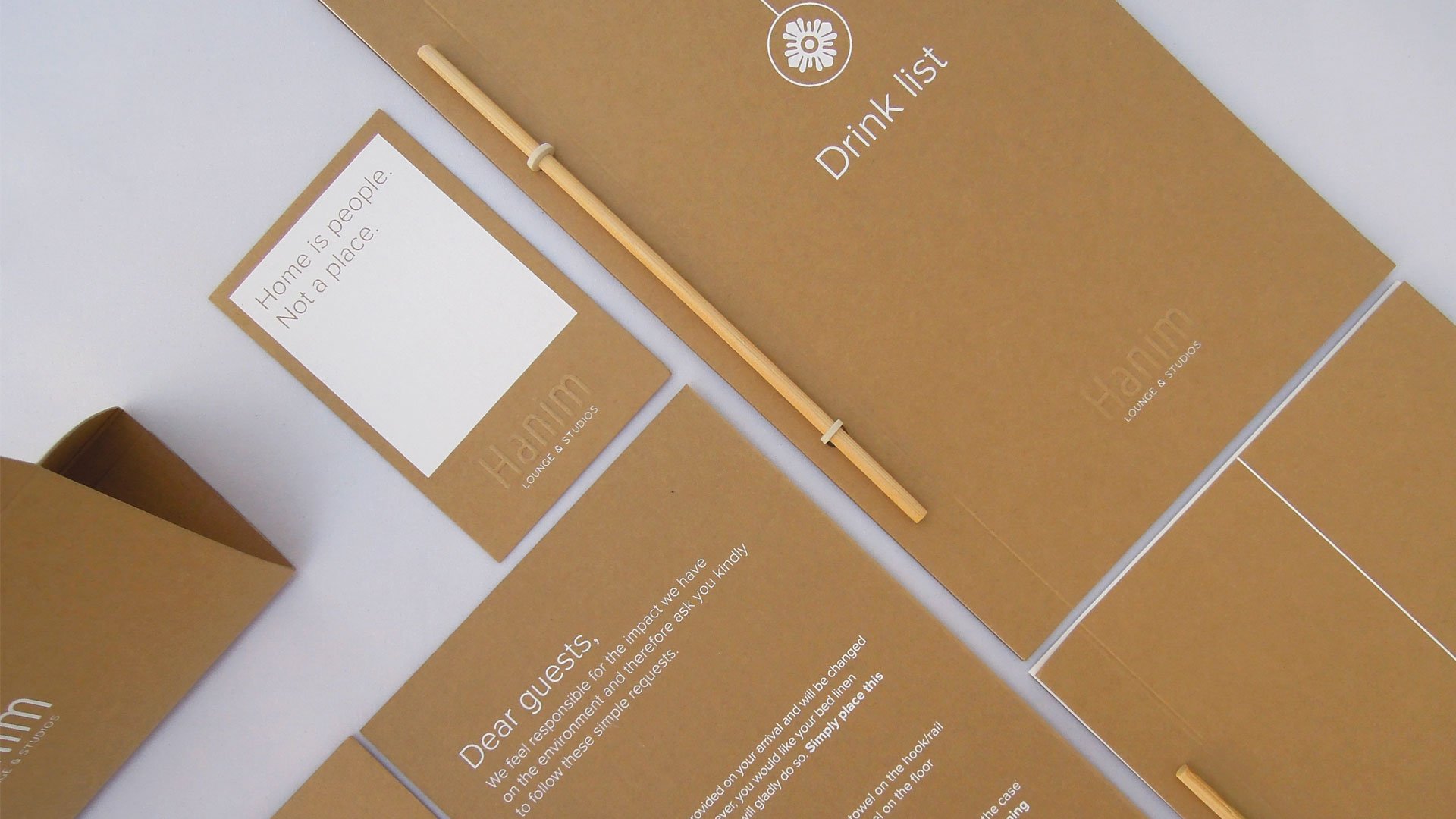
Then the real creative process was to blend the watercolour paintings into all of the hotel's communication materials.
I designed stands, note cards, door signs and key rings, all delicate and understated through the sophistication of the watercolours.
Paper was our main medium while the watercolours became the main graphic element of all the communication materials, adding a unique and sophisticated touch to the simple style of the hotel.
The Results
This project was laborious work that included many proposals, discussions and ideas exchange.
The new design brought to life the "comfort of simplicity" philosophy of Hanim adding a completely new experience, made of colour and art.
The client says:
Hanim is for those who come as friends.
-Rena and Manto, Hanim owners